CARMEL, Ind. – The Heartland Collegiate Athletic Conference (HCAC) unveiled a bold, revitalized visual identity on Monday. The comprehensive redesign includes distinct primary and secondary logos, a complete suite of sport-specific and championship marks, and an exclusive custom font.
The HCAC partnered with Skye Design Studios (SDS - www.sdsbranding.com) – a national leader in sport branding – for the project. The HCAC and SDS engaged partners from all 10 member campuses throughout the rebranding initiative.
“We always viewed this project as much more than just a primary logo redesign,” said HCAC Commissioner Jay Jones. “This effort was about developing a full brand overhaul and changing the look and feel of everything we do as a conference. As a result, we needed a partner that understood the wide range of deliverable elements that we wanted to have and that realized the need to get extensive feedback on how our league could better define ourselves visually. Skye Dillon and his team at SDS hit the mark from start to finish and were a pleasure to collaborate with. I am really excited to start using our new branding and see the fresh look at conference events.”
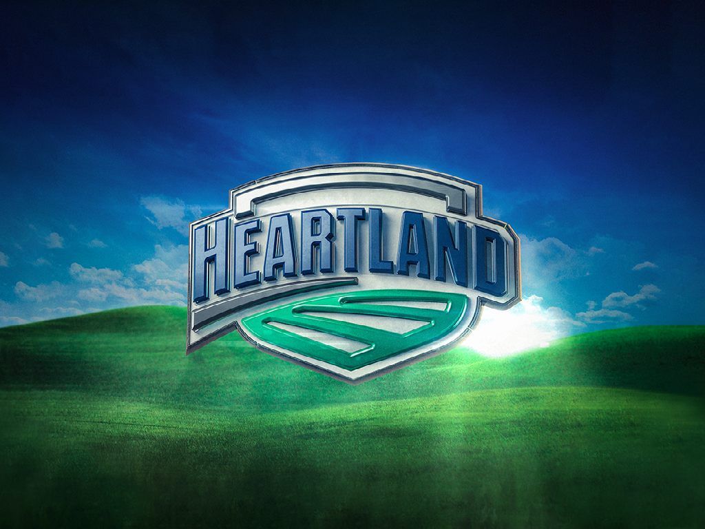
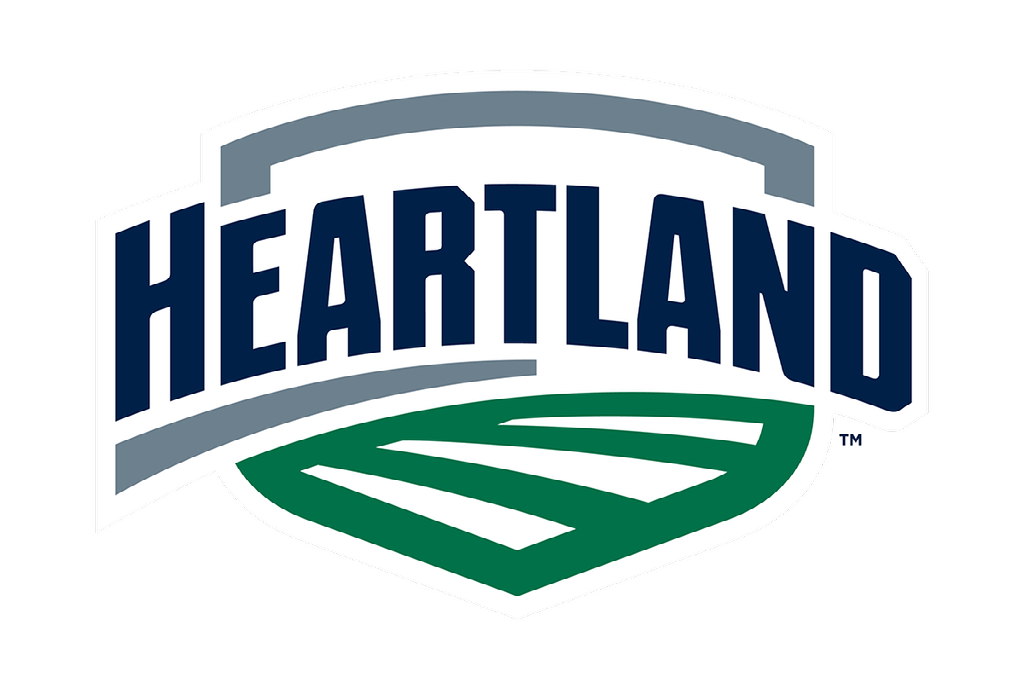
The two words forming the league’s moniker served as inspiration for the brand narrative:
HEART – The word ‘Heart’ is underlined to emphasize the competitive spirit and unified community of the HCAC. This positive bond of community felt within the conference was referenced universally throughout the process. Unity, sportsmanship and a sense of family was concurrent in the feedback from student-athletes, administrators and other conference stakeholders. Passion and commitment were also identified as key league values.
LAND – The land is represented visually in the logo with three rows of abstract farmland. This element showcases the geographical link of the 10 member campuses while also highlighting the conference’s membership in NCAA Division III.
“It was a joy to collaborate with the Heartland on its new identity, said Skye Dillon, founder of SDS. “The name says it all – Heart, Land. We needed to strike a balance between representing the conference’s physical backdrop in America's Heartland with the competitive camaraderie of its membership. As such, it was designed to feel uplifting, strong, and enduring while dually reinforcing its tagline, ‘The Heart of D3’.”
The new look also features a fresh color palette which further amplifies the Heartland’s story. Blue pays homage to its skies and waterways, while green implies growth, depicting rolling hills and farmland. Finally, dark gray emboldens the brand, recognizing the steel-cut, hardworking reputation of the Midwest.
The identity was developed with adaptability and cohesiveness in mind, allowing for each member institution to utilize both the primary and secondary logos in their own distinct colors. Further, logos representing each HCAC sport, championship, and honors such as the Commissioner’s Cup and All-Sports Champions follow the same graphic approach established in the core conference marks.
The new HCAC brand is also highlighted via a new website partnership with SIDEARM Sports, an industry leader in the field of athletic websites.