The Elements of Good Graphic Design are the components or parts of a work of art or design. More simply put, they are the ingredients of art.
line
A mark made by a tool as it is drawn across a surface. The tool can be almost anything – a pencil, a pointed brush, a computer and mouse, even a cotton swab. Also, a line is defined as a moving dot or point, or can be called an open path.
Line can describe shape, so we can recognize objects.
Implied Line - A line created by positioning a series of points so that your eye automatically connects them.
Psychic Line - No real line, there is a mental connection between two elements.
Horizontal Line - implies quiet and repose, tranquility.
Vertical Line - has potential for activity or movement, also represents strength and nobility
Diagonal Line - suggests motion.
Contour Line - A line that follows edges of forms, to describe outlines.
Gesture Line - A line that shows action or dynamics of a pose.
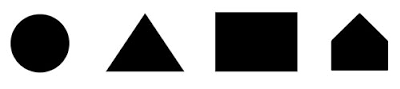
shape
Shape: a visually perceived area created either by an enclosing line, or color or value changes defining the outer edge.
Shapes can show “realism” or images as they are seen.
Shapes can show “distortion” or have a purposeful exaggeration of what is seen.
Shapes can show “idealism” or represent something as it “should” be in an ideal world.
Shapes can show “abstraction” or a simplification of natural shapes to essential basic shapes
value
Value: the description of lightness or darkness of a visual element
Value Contrast is the relationship of one element to another in respect to lightness and darkness
Value Contrast helps identify the separate elements of a design.
Low Contrast uses a narrow range of values meaning there is not much difference in the lightness and darkness
High Contrast uses a wide range of values or a huge difference in the lightness and darkness in a design.
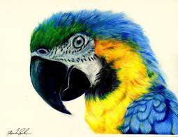
color
Hue is the name of the color. Example: Cyan, Magenta, Yellow, Black
Value is the range of lightness or darkness of a hue. Example: Light Blue, Dark Blue
Saturation is the brightness or dullness of a color.
RGB stands for Red, Green, Blue which are the three primary colors when working with light. All colors seen on a monitor or screen are created using the RGB model.
Red, Green, and Blue are additive primaries because when you mix equal amounts of Red, Green, and Blue you create white light.
CMYK stands for Cyan, Magenta, Yellow, Black which is used for offset printing or four-color process printing.
Cyan, Magenta, and Yellow are subtractive primaries because when these are mixed they create black.
Subtractive Primaries deal with ink or pigment while Additive Primaries deals with light.
format
Format: the substrate or support for a graphic design.
Format deals with size, shape, material, and purpose.
Contextual Constraints can be where and how the designs will be seen.
Magazines are seen up close
Billboards are seen while driving and at a distance
Budget is also a contextual format
Contrast
Contrast is created when two elements are very different.
Types of Contrast
Size - Use various sized elements to create contrast
Color - Complementary colors are easy ways to create contrast. Use colors that are very different from each other.
Shape - Use different shapes to create contrast
alighnment
Alignment is placing items on a page so they have a visual connection with something else on the page.
When items are aligned it creates a stronger, cohesive unit.
Even when elements are physically separated from each other, if they are aligned there is an invisible line that connects them.
Alignment tells the reader that different elements belong together.
Credits:
Created with images by werner22brigitte - "smoke background artwork"