For this project I will be creating a portfolio book and an online portfolio. The portfolio will be made to look professional but creative so it engages people in hiring me. I will also be fully rebranding myself too throughout the project.
The challenges I will address in the project is being able to create successful pieces of work that show my area of design off well. I will also need to create pieces that engage my target market as the purpose of this project is to showcase myself to be able to get a job. I will need to research and plan out how I want my portfolio to look, so i will look into portfolio designs and layouts.
The learning objectives I hope to achieve by completing this project
- One of the main learning objective I hope to achieve by completing this project is to have a portfolio that I am proud to showcase and promotes my work well as a designer.
- The second challenge will be the speed of work produced. I will set myself weekly projects. One of the projects will be to create 20 logos in 20 days.
- Time management will be a big learning objective for me as I want to create more pieces of work at a better standard that I will be proud of. This means I will need to work on my work more out of class too. I will do this by producing a detailed timetable which includes a tick list of everything I will have to do each week this will keep me up to date and I will keep focused on what I need to do and what I’ve already created.
- Learning how to use InDesign which will be a new software to me, this will help with the design of the layout of my print portfolio.
Program List:
- Adobe Illustrator
- Adobe InDesign
The motivation to do this project is that it will push me to be a better designer and will also potentially create job opportunities for me. Researching into the area I would like to go into which is branding will give me a better understanding for when I go into a company. I will know exactly what I am able to do so will know the jobs to take on.
The project plan / schedule will be creating a timetable with exact dates and times on when projects will be completed so I know exactly where I should be and what I need to do. This will be able to show where I am going wrong too with time management so I will know what to change in the future.
To speed up the process of my work one of the challenges I have set myself is to do 20 logos in 20 days. This needs to be at a professional level so I can add the work into my portfolio.
Learning how to use InDesign will help me make my portfolio layout look professional. I have looked at a few tutorials which has already taught me a lot for when I come to design my portfolio.
The link above I have look at shows a step by step tutorial on how to make a front cover for a portfolio using InDesign. By using step by step tutorials it did not take me long to pick up on how to use InDesign.
Logo design research
Logo design needed to be one of my portfolio pieces I worked on throughout 605 because throughout my portfolio I did not have many design pieces that looked further into the area I would like to go into which is branding.
I set myself a mini project to do ’20 logos in 20 days’ but decided to cut it down to ’10 logos in 10 days’ then add to it if I had time later on throughout the whole project. The reason for this was because I didn’t want to only have one piece completed as I knew there were other pieces of work I needed to create that looked more into the field of branding.
For the ’10 logos in 10 days’ project I made a list of random objects I could make a logo for then narrowed it down to specific ones that I find more interesting to do
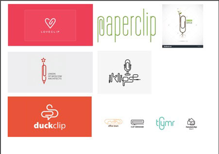
Paperclip logo
The first logo was a paperclip/stationary company. I created a mood board of all the paperclip logo variations I liked that I had found on the internet. Some of the images were certain parts I liked in the image that I thought I might be able to add into my logo.
From the mind map I made a list of names I thought might work well for the company name. I then got feedback from other students to see which they liked best.
Above were the first mock ups I made. I decided to try the same style out for every name to see which one worked best. I wasn’t fully happy with these so I got some feedback. After having feedback, I chose to still use the ‘A’ as the main letter and continued using a circle. I decided to change the name to something that wasn’t as obvious.
Above are the final versions of the paperclip company logo. Instead of using a company name that began with the letter A I thought it would be better to use a name that used the letter throughout so it wasn’t as obvious.
Dentist logo
After looking at many different dentist logos there were a lot of variety some using animals such as elephants and others using smiles/mouths. Looking at inspirations gave me an idea to work on straight away, it also gave me a name to work with as the shape in the logo I was trying to create was a ‘W’ so I thought of the name ‘wisdom dental care’.
Feedback from this design made me realise it did not work as well as I imagined it too. I kept to using the colours in the design but looked more into the word ‘wisdom’ instead.
As wisdom means ‘the quality of having experience, knowledge, and good judgement; the quality of being wise.’ (Wikipedia) I decided to look into animals that were wise.
http://www.nbcnews.com/id/24628983/ns/technology_and_science-science/t/smartest-animals/#.WSX3olcnh-U - The 10 smartest animals.
Even though an owl is not on there from feedback from asking which animal comes to mind when you think of the word wisdom most people said an owl.
I tested out the design with both an owl and dolphin to see which one worked best. From feedback people said the owl logo worked better.
Sushi logo
Sushi logos were all very similar but each had their own take on things. I used inspiration a lot to create this logo but it still needs some more tweaking as I am not 100% happy with it.
When I touch up this logo I am going to find a better typeface that flows more with the design.
Makeup logo
From looking at other logo designs for makeup brands they mainly used just text in a logo. Many logos were the brand owners name. For example, Nars, Estee Lauder, Chanel.
Many other makeup brands have a meaning behind the name of there company whereas others are just simply shortened for makeup art and cosmetics.
http://www.refinery29.uk/beauty-brand-name-meanings?utm_r29_redirect=us [makeup brand name meanings]
As many top makeup brands use their name for the company I felt my name did not flow as well as others so I decided to choose a brand name similar to other makeup brand names such as ‘Smash box’, ‘Urban Decay’ and ‘Benefit’.
The feedback from this logo was to add the ‘W’ to the word ‘Glo’ as many people read it wrong. Other feedback was to work on the typeface more to make it work better for the brand.
Watch logo
For my watch logo I wanted to find out something unique about watches as I had an idea in mind of how I wanted the logo to look but it involved using a number. After reading about clocks I found out that in a day a clock makes 44 right angles with the little hand and big hand. This was perfect for the logo idea I had as I figured out that the number 4 already had a right angle inside the number so I decided to use the two number fours as the main logo.
I was not sure if it worked with just the ‘44’ on its own so I wanted to add some variations to get feedback on so went with the name ’44 TICKS’.
The feedback I got was that the ‘44’ works better on its own as it has a meaning behind it, I just needed to work more on the positioning and typeface used.
Yoga logo
Yoga logos all seemed to be very similar. This was one of the hardest logos out of the 10 to create. When creating the logo, it seemed a very basic design that I was not happy with, I decided to get feedback to give me help to improve it as I was really not happy with it.
Above is the logo I got feedback on. The feedback helped massively, when re-doing this one I am going to get rid of the lotus flowers in the back ground and use just the meditation person in the middle. I am going to try out fine line art. I also need to change the name as ‘to the mat’ is more of a statement.
Airline logo
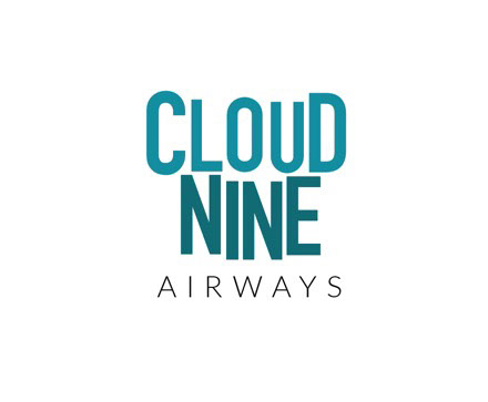
After researching airline logos, I could see that most of them used type for there logos. Using the name ‘cloud 9’ I tried out a type logo using two different shades of blue.
From the feedback I realised straight away where I went wrong. Using the number nine instead of writing it out as a word was a big mistake as airlines don’t tend to use numbers in their logos and if they do they will always write them out. The feedback was also that I had too much going on so I needed to strip it down.
This was the second version of the logo I designed. It still needs a lot of work but I tried out writing the word ‘9’ instead of having it as a number and it works better already.
Noodle bar logo
Looking at other noodle bar logos many of them used the same elements such as, bowls, chopsticks etc. The colours used were also similar too reds, whites, blacks.
I decided I wanted a red background and after creating the square shape the name instantly came to mind ‘red box noodle bar’.
The feedback I got from this logo was that I needed to look into different typefaces as the one I had used didn’t suit it well.
Jewellery logo
After looking at other jewellery logos I decided to use my own name for this one to make it a little more personal as it was a handmade jewellery company.
The feedback I got for this logo was that I needed to experiment more on typefaces as the ‘Y’ stood out more than the other letters and looked off balance. I also need to venture into trying out colours for the text even though many other logos just left there’s black.
Art gallery logo
From looking at other logos I decided to just have a little play around with this logo after I had seen a logo that gave me inspiration. The use of colours was easy to pick as they were similar to the art style chosen.
The feedback from this logo was to get rid of the second box. Also to round off the the block under the letter C.
Above is the edited version of the logo used the feedback I got.
The '10 logos in 10 days' project helped me a lot and throughout it I picked up speed in creating logos. As the main aim of the project was to build my logo designs and also to make sure I am able to create a logo in at least a day if not quicker. At the start of this min project, the first logo I tried to create took me a whole day to do. Then by the end of the project I was creating 3/4 logos in a day.
Layout Research
After researching into branding and graphics, I realised I needed more layout design pieces in my portfolio. So I looked for inspiration on Behance to get an idea on what others have done for layout pieces and to see what worked well.
I found many ’36 days of type’ pieces helpful. This kind of work involved using the alphabet and numbers and creating a design/theme throughout each letter. The first theme I tried was an art deco style inspired by Barcelona. The art deco theme didn’t flow for me so I decided to change it, I looked through my previous work and found an old constructivism piece so I decided to try out constructivism art throughout my alphabet piece.
Each of the pieces above had a theme running through each letter. As I wanted to use constructivism art for my theme I gathered some images together which I liked best to take elements from.
These are the three constructivism posters that I used for inspiration throughout my layout alphabet type piece. As constructivism is a Russian style art, I looked for Russian typefaces to show consistency throughout the theme.
The typeface I originally used was called ‘Red October’ but as I was creating the layout piece I went into further detail to create my own typeface. I used the Russian block style typeface and edited it to make it my own. I used triangles throughout each letter making sure the consistency flowed. It took a few attempts to final get the font to work how I wanted it too as in the beginning I didn’t use a set shape throughout each letter so I wasn’t seeing the consistency.
Credits:
Created with images by University of Salford - "Graphic Design TechHub Manchester murals project"