Research
Final
Product
Rationale
Sofie Kreidstein
Mr. Raemisch
TGG4M1-01
February 22, 2017
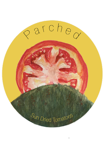
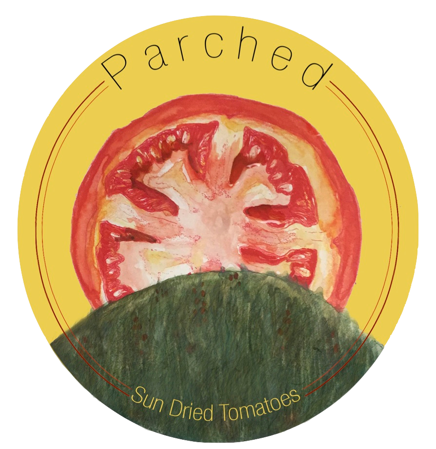
The product I have designed is a sun dried tomato jar. When brainstorming, I knew I wanted to design something with a modern take on classic tomato jars with hand drawn imagery. I chose the name Parched because it encompasses the essence of the product, being sun dried, is one word (adding to the minimalistic qualities), and it's humorous due to the strange use of a word usually used to describe thirst. I hand painted the tomato on the hill to incorporate some classic techniques. Then, I used a sans serif font, clean lines, and a solid background to contrast the organic nature of the rest of the design. As for my use of colour, I extracted a simple palette from the colours i used in the painting. The company itself is devoted to sun dried products, so the logo, is most naturally a sun. Over all, I learned a lot about marketing and product design through this project . I enjoyed the time I spent on it because while there were very specific guidelines for this project, I found a way to incorporate fine art.
Credits:
Created with images by Klearchos Kapoutsis - "Sun-dried tomatoes"