- - I drew a tree because i looked out my window and saw one. For this i used oil pastels and marker pen because I wanted to create a cartoon look and thought bold lines and block colors would do that. I think these materials do work well together because the oil pastels are not over powering and the marker pen makes them stand out more. I do like these materials together, they are really easy to use, a little messy but after using them more than once you could easily get the hand of them. If i was to do this again i would probably add some leave that have dropped to the floor.
i drew this lift because i thought of idea to have in a game, different levels in the game you have to go in the lift to get there. for this i used marker pen, oil pastels and wax crayons. i wanted it to be simple and not to detailed. I think the oil pastels would of worked well if i used them on there own as well as the wax crayons because i think they both go with the marker pen but don't work well together. I don't really like how this turned out because it could of been a lot better using different materials. If I did this again I would probably just use wax crayons.
i drew this book because when I did it I was sat next to some books. For this i decided to use charcoal as I thought it would create the old look book look. I thought using charcoal would of been a lot easier to use than it was, it smudges a lot, it could of been done a lot better. I didn't like using the charcoal for this as there is a lot of small detail that i couldn't do with it. If I did this again i would add color and used a pen for the detail I couldn't get with the charcoal.
I drew this leg because i drew another picture with a leg in it and i thought how i could it be done differently. i decided to use charcoal for this as i know it smudges and i thought i could use that for the shading. i thought the charcoal worked really well for this type of picture, even if i did it wrong i could just blend it in and fix it. i think the image turned out well but i didn't really like using the charcoal as it was just messy and got all over my hands then i have to try and not touch the page. if i did this again i would probably just use black charcoal and not gray.
i drew this billboard because its something I've never drawn before and wanted to see what it would come out like. i used charcoal for this because i wanted to go for the cartoon 'child' look. i feel like it did work well as i got the look i wanted but although it does look a little messy, especially the writing. I do like this as i like the effect it gave off. If i were to do this again i would do the writing in a different material like pen or ink.
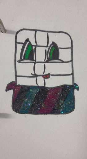
I drew this chocolate the theme was confectionery. For this i used felt tip and nail varnish but couldn't get the same with a pen or paint. I think that i did work well because the nail varnish was used as if it was just paint and was easy to control. I do like these materials although I don't they worked worked well together. If i was to change anything i would color the actual chocolate and not add the glitter as I think it's over crowed.
I drew this chair as it was something that was in front of me. For this i used the material of paint as I like the effect it gives off and how bold the colors turn out. I thought the paint it's self worked well but the black for the details are wobbly and messy. Over all I do like the way this turned out, paint isn't hard the use although they can get messy.
I drew this hand as at the time I came up with the idea I was painting my nails, so I thought why not draw a hand with painted nails. I used nail varnish and pen, as i said i wanted to paint the nails and i used pen because i didn't want some thing to thick that would over power the nail varnish. I think these materials do work well together also the colors go well together as well. I do like the way this turned out its simple but elegant, I also liked using the materials, they are simple and not hard. If i did this again i would probably add more detail to the hand.
I drew a light bulb because the theme was to draw something about light. For this the materials i used as pen, felt tip and wax crayon. I thought these materials worked well because the was crayon created a transparent look which is what i wanted. I like the way this has turned out as i feel the materials worked well together. If i did this again i would probably draw it with a bit more detail.
I drew this creepy person and mask because the theme i had to draw from was nightmares. I used a pencil for this and felt tip, i used pencil for the details and shading and red felt tip to high light the blood and black felt tip the darken the eyes and mouth. I feel like these materials did work well together because the felt tip stands out a lot. I like the way this turned out as it looks like what its supposed to and i think pencil is really good to use for shading. If i did this again i would probably use a brighter red for the blood on the end of the tongue.
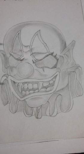
I drew this clown because the theme was 'spooky'. I used pencil for this as there was a lot of detail that had to into it and a lot of shading i had to do, and i feel most comfortable shading with pencil. I feel this drawing turned out well because, you can see all the small details and the shading isn't over powering. If i was to do this again i would probably add some color with wax crayons.
i drew this hair because I i wanted to show how complicated hair can be. I for this i used the materials pencil and pencil crayon. i used pencil because with ink and pen its hard to get the detail into the different strands of hair and layers of hair. I thought these materials worked really well because you can see each section of the hair and the bow really stands out as its bright red. I like how this has turned out well as you can tell that its a girls hair. if i was to do this again i would probably neaten the ends of the hair out.
I drew this fairy because i found a similar picture on the internet and i liked it so I drew it but changed it a bit and put a dark twist on it. i used the materials of pen and wax crayons because I thought pen would be good to use to make it dark, and much easier to control than ink ans the wax crayons because i only wanted a slight touch of color on it. I think the materials worked well because non of it was messy and it turned out how i wanted it to. i like how it turned out and it does have that dark creepy look to it. if i did this again i would make the arm a little bit wider because it looks to thin.
i drew this tree scene because I drew a tree and wanted to expand upon it. I used pen and ink for this because i wanted the branches to be thicker than the rest of it so they stood out more. i thought the materials would of worked better if i was careful with the ink but i messed it up and smudged it. i do like the effect it gives off 'creepy' so I'm happy with it. If i did this again i would make the footpath stand out more because you cant really tell its a foot path.
i drew mickey mouse because the theme was Disney so i did the most recognizable Disney character but thought id make it more interesting. the materials i used for this was pen, pencil, ink and glitter spray, i think these did work well because i managed to keep the materials tidy and neat and the grey pencil really makes him stand out more with popping out the page. I like how this has turned out because the glitter spray adds a shine to the whole piece and makes it sparkle.
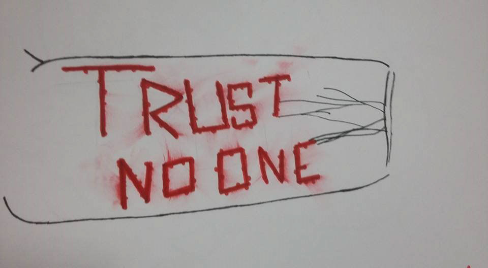
i drew this arm because i was going through Facebook and saw a picture of self harm so i thought id write a message on an arm. the materials i used was pen and felt tip, i wanted the 'trust no one' to stand out more than anything so i used pen because its thin and wouldn't over power it. I like how it turned out because I think it sends off a powerful message. If i did this again i would probably do the writing in ink and make it drip down the page.
i drew an eye brow because i had to draw a body part and this is the first one i thought of. i used ink for this, because i wanted to make it dark and stand out. i think the ink worked well because it was easy to use and didn't take long. I like how it turned out because its a good eye brow and its neat. if i did this again i would color it brown with a felt tip.
i drew this dragon because the theme was wings, and its the first thing i thought of that as wings. i used pen, fine liners and felt tip for this because i wanted to make it bright and colorful. i think the materials worked well together because non of them over powered the other. i like how this turned out because you can still see the details on the wings and dragon with the pen. if i were to do this again i would either replace the green or blue for a lighter color.
I drew this snail because the theme was insects and snail was the first thing that i thought of. for this i used marker pen because i wanted to create a cartoon so i did block colors and thick black lines. i think the materials worked well because i go the look what i wanted. I like how it turned out because i achieved what i wanted to. if i were to do this again i would probably add a snail trail or just some thing extra to it.
Credits:
Created with images by WikiImages - "the pleiades star cluster star star clusters"