My name is Michael Bordeaux and I enjoy taking photographs. Taking photos is relaxing and allows me to use my creativity. My favorite past time is baseball.
- The theme is "end" and this is represented by the end of the candle burning. All that is left is the aroma of the candle and the smoke from the fire, representing the end.
- The theme is "noisy" and this is represented by the large amount of commotion that is going on in the picture. There are wires everywhere and different parts that do different things.
- The theme is "resolutions" and this is shown because it appears as if he is fighting to reach an end goal, whether that be surviving, harming others, or making peace.
- The theme is "journey"which is shown by the knife which is placed on the log. This makes the audience wonder why the knife is there and what happened for it to be there.
- The theme is "soft" which is represented by the calming mood given by a candle. A candle and its soft burn can make a room seem more peaceful.
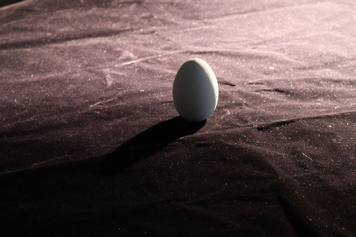
- The theme is “what is it” which is represented by this blue rock. It is intended to make the audience think about what they are actually looking at because it was taken close up which allows for different perspectives and interpretations.
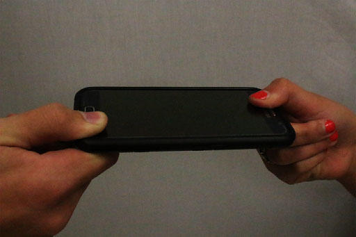
- The theme is “can’t live without” which is represented by 2 people pulling on a phone. Many people these days, including myself, can’t live without using the internet. One hand is trying to keep the other person from taking the phone because it feels like life or death.
- The theme is “fire” which is shown by the sunset. Fire gives a feeling of warmth and illuminates the area much like this sunset. It almost appears as if there is a fire but in reality it is just the Sun.
- The theme is “mirror” because a mirror has reflective qualities just like the water. There is a form of symmetry created by the reflection of the mirror-like water.
- The theme is “parallel lines” which is shown by the fence. It creates strong parallel lines and the side view mirror provides a parallel perspective than what is seen in the background.
My strongest image is the parallel lines image because I used what I've learned to create bokeh and I have great composition with the rule of thirds and strong leading lines, which brings the attention to the mirror and what is being reflected.
My favorite photo is my portrait photo of Patryk in a frame. I used my knowledge taught to me on how to take a portrait photo to first take the image. Then, I used editing skills taught to me to get rid of fingers in the frame and to make it appear as if he was in a tintype. This makes it appear as if he is trying to escape. My least favorite photo is the "N" for the letter project because it has no composition and is not interesting at all. I feel as if I have gained a lot of knowledge on how to create and image rather than just take it. I have also learned how to setup the camera to allow me to capture what I want.
Credits:
Created with images by Empyrius II - "Rule of Thirds"