What is this project?
In this project we had to choose a topic that we know have chnaged throughout the past years. For my topic I choose to see the change in how long it took to swim 1500m in swimming. I started in year 1912 until 2016. We had to build a graph, split the graph in 3, make 3 lines of best fits, make an overall line of best fits, and then I will make predictions.
What is a 1500m race?
1500m might seem like a lot but in reality it is only 64 laps to swim. Think of it this way 25m=1 lap, 50=2 laps etc. Normally it takes 20-30 minutes to swim a 1500m for 12-16 year old's. Yet the world record is 14 minutes!
Graphing
The first thing I had to do was to use Desmos to create a graph with all of the times since 1912. The graph turned out to me a negative slope because the times are getting lower and lower each year.
After we made a graph with just the data points on it we needed to split the graph into three different parts and make a line of best fit for each of the three parts.
Line of best fit #1
Next I have to find the second best line of fit
Line of best fit #2
Line of best fit #3
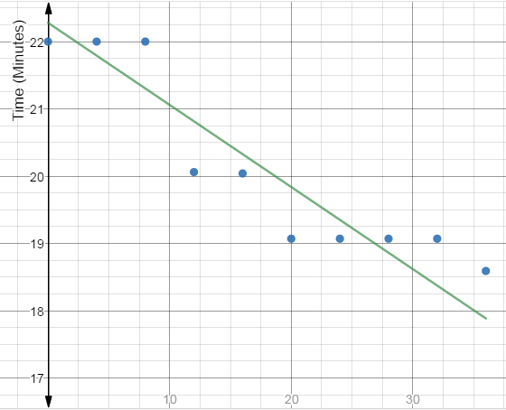
Overall line of best fit
The overall line of best fit goes on forever and never stops. I also used this line to see what the world records would be in the future. Though this line is not always accurate. If you keep going down the line it might say that is 200 years the world records will be 0 minutes for 64 laps! That is impossible. It might always say that the 1500m record is faster than the 200m record. You can not always trust them.
Predictions
I predicted using my graph that in 50 years (2067) the world record time would be 10.825. That is 3.485 minutes faster only in 50 years. I also predicted that in 95 years time (2112) the world record would be 8.143. That is 6.167 minutes faster than the current world record in 95 years.
Trends
In my graph it is always lowering or staying the same. Not one point in my graph has gotten slower in the times. In the late 1900's and 2000's the records are starting to stay in its place only improving 1 minute or less than one minute every few years. In the first 30 years in my graph it looks like steps because at that time it was easier to make records since the times were slower.
Thank you!
Credits:
Created with images by tpsdave - "swimmers swimming race"