Part 1
Global Warming
High levels of carbon dioxide in our atmosphere are caused by cars, airplanes, and the use of fossil fuels. This is a graph that supports the greenhouse effect.
97% of all scientist believe in global warming. This chart helps prove their points, showing the ten hottest years on record.
Rising Sea Levels
This chart shows how much the sea level has been rising throughout the years.
More Natural Disasters
This chart shows the increase in natural disasters as time goes on. These are caused by the rising water levels from global warming. Floods and storms have continued to increase in frequency.
Part 2: Consequences
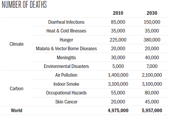
This chart shows the current deaths caused global warming and the estimated deaths in the future.
This picture shows the effect of global warming on the ice caps and the predicted size in the future. https://www.gfdl.noaa.gov/the-shrinking-arctic-ice-cap-ar4/
This chart shows the number of deaths from natural disaster caused by climate change. The frequency of natural disasters has gone up and will continue to go up if we keep polluting our planet. This shows the deaths and increasing rate of deaths from natural disasters.
Part 3: Bangladesh
This shows the countries most at risk from climate change. Number one on the list is Bangladesh.
"Bangladesh, with its low elevation and severe tropical storms, is among the countries most vulnerable to the effects of climate change, though it has contributed little to the emissions that are driving it." -Kadir van Lohuizen for The New York Times
Scientist predict that the rising Sea Levels will submerge 16% of Bangladesh and displace 18 million people in the next 40 years. This will have a catastrophic effect on the nation.
Although Bangladesh is facing the effects of climate change head on, the country has made some progress to help it's survival and struggle.