What does UX Design mean to me? It means making digital experiences non-frustrating.
So what experience can I make non-frustrating? Well, work with what ya know. I know ComicCons. As a frequenter of said cons and a frequent cosplayer, I know how much of a headache such a thing can be. The convention center is huge, crowded, noisy and the wifi and cell reception sucks.
Solution: create a very simple wayfinding and schedule app to use at the event. It has to be basic enough to load up without using too much data and to load quickly (no animations or heavy graphics). This is a place where nearly everyone is using their phones all the time, taking photos and sharing them on social media.
I've created 3 personas based on my own and fellow con-goers' experiences. I have either experienced personally certain aspects of these personas or am friends with someone who has.
There's the newbie:
The family:
And the experienced cosplayer:
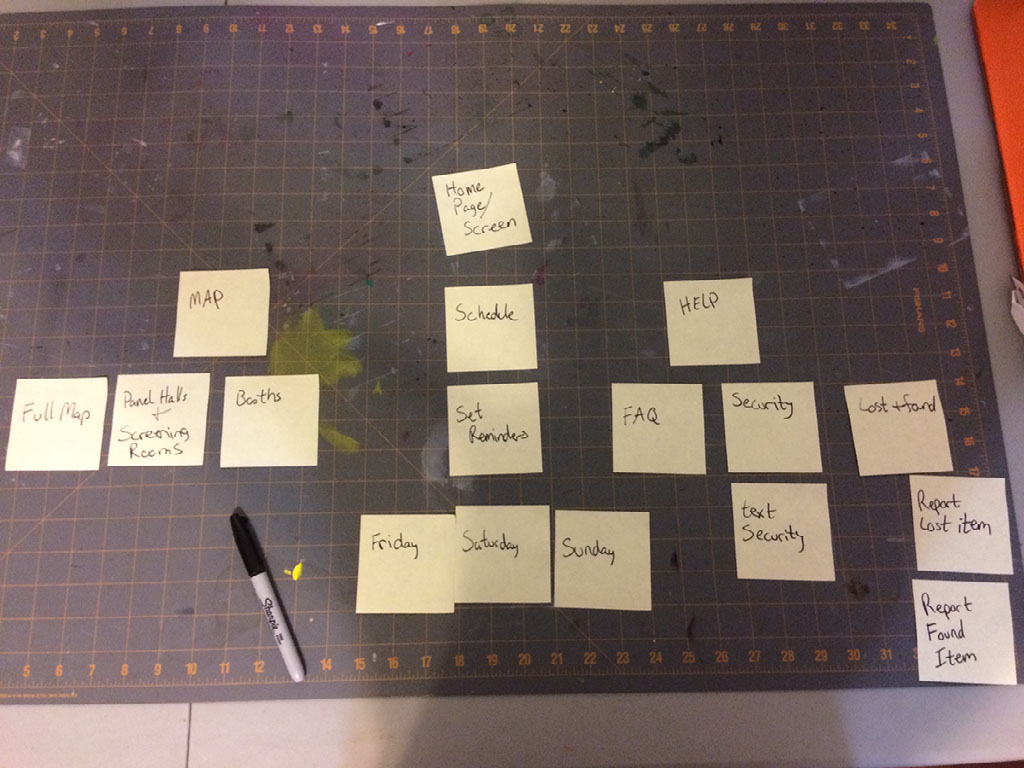
Next, how to lay out the app. We start with a pile of post-its
Oh what, oh how, to organize? Here was our first try:
I'm trying to keep this app really simple. Reception and signal inside some of these huge convention centers is not great. We ended up combining and removing a few things to keep it easy.
Fewer post-its = easier use + faster load times.
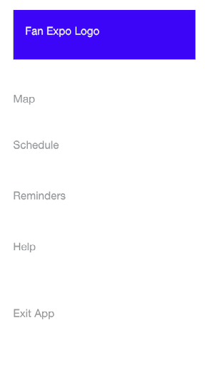
Finally, the Site Map:
Simple! I hope!
Next up, I created wireframes to test the app out on some users. After thinking some more about the navigation and what a user might need, I added some options back in on the Maps section.
Here's a video of one of the testings. The (slightly) willing participant was my lovely husband
Next, just to practice, a few cleaner wireframes using Adobe XD.
Next up, creating a mood board. I'm generally not much for mood boards. In personal projects, I've already thought out what I want the thing to look like. For this project in particular, I'd be creating a product for a company that already has a look. So my "mood board" was the front page of their website.
It already has the colors I would use, some texture in the background at the header, and a logo.
Now a Style Tile to put all the elements together. I'll admit, I love the phrase "style tile." So rhym-ey.
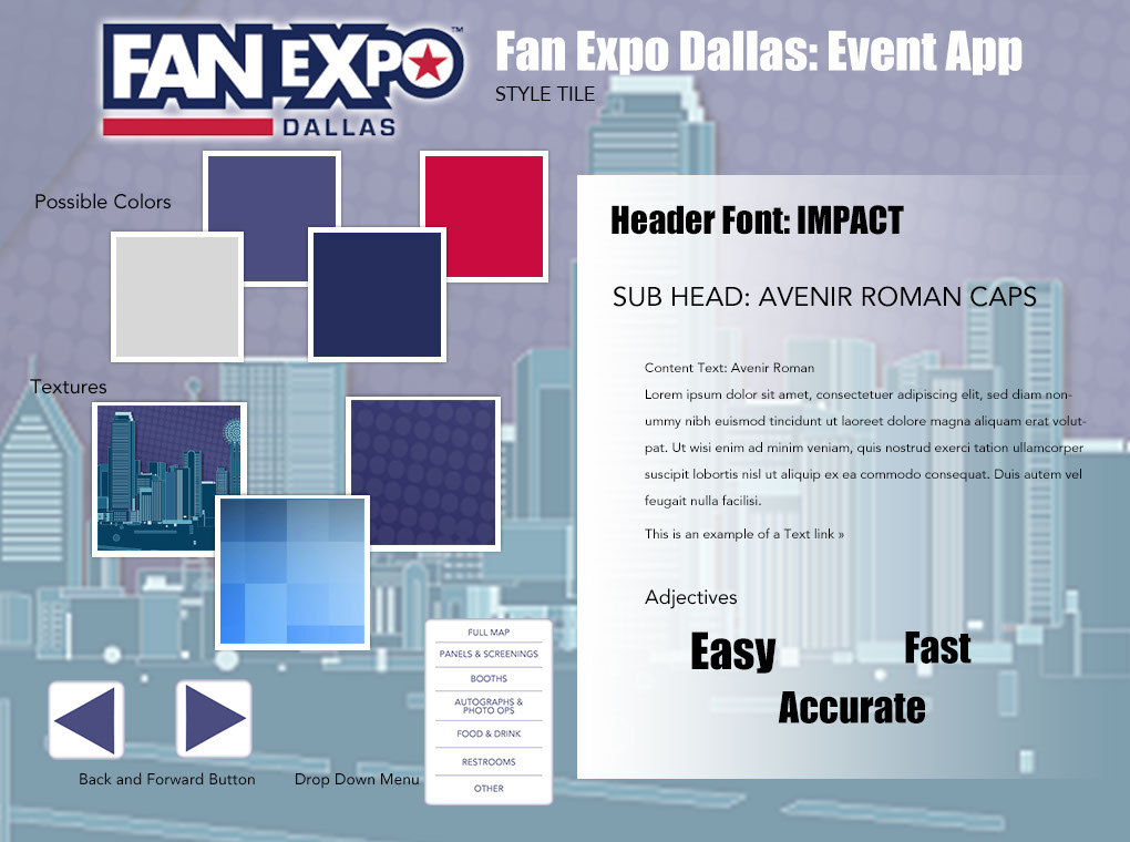
I tried to find a blocky font to go with the heavy font of the logo. I wonder if I should have made the color and texture boxed a bit farther apart and possibly added hex codes to the color swatches.
And here are 3 sample layout screens. I need to find a better way to add those forward and back buttons.
I made many changes along the way. I realized I had only used my header font on the opening screen and no where else. I added it to the menu screen and as the header font on all other screens. That can be seen in the testing video below.
I also removed the forward button completely. Currently, Adobe XD doesn't have a way to prototype drop down menus so I changed them to separate screens that swipe in from the left.
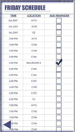
I had wanted to have left to right scrolling on the Map and Schedules pages but XD currently doesn't offer that. So I had to find a way to show the schedule and reminders column. I opted to just make 2 separate screens.
After creating several screens and adding edits (like making check boxes bigger) it was time to test this prototype again on my, again, slightly willing husband. He goes through all the screens I created.
I learned so much during this class and now have a fountain of ideas for web and mobile apps to create. What a fun journey!
I like how the courses are laid out. I am not a teacher of Adobe products but I use them everyday in my full time career and in my side job (where I do teach sewing skills). Having to product test was a great way to get me out of my comfort zone. I don't like sharing work that is so rough, like a wireframe sketch. And trying to describe what I was doing to my testers was a bit embarrassing. One of my testers told me upfront that he hates technology. That makes you the perfect candidate!
I enjoyed creating the interfaces the most. As a graphic designer, it was right up my alley of skill level. There are so many standards to web and mobile design to consider when designing apps that it was hard to keep track of it all. A few students had to let me know that the standard for a finger tap is 36pixels. I had several boxes in my app that were to small to be selected.
I took this course so I could decide a new career path. I'm currently a graphic designer but I've been seeing loads of jobs for UX/UI Designers and the pay is much higher. This course peaked my interest in the field and I am going to explore it further.
THE END! For now...