RESEARCH
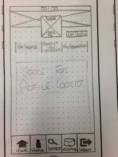
A number of potentially handy application screens, that I knew would be included into the final design no matter what the layout, were scribbled onto iPhone templates following the completion of the personas. I then roamed the upper floors of the college and found three people to sort the cards in to a layout they felt was suitable. I then highlighted the similarities and moved into my initial ideas.
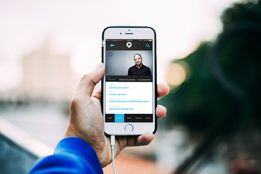
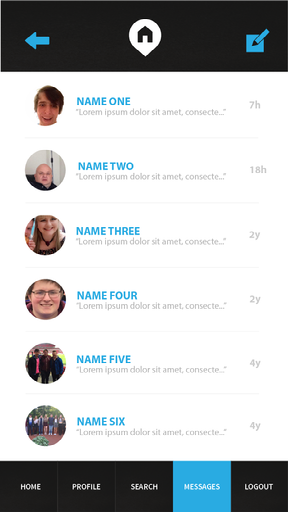
In total, 18 screens were created during the development of the application. Overall, I feel that my design suits the brief well in the sense that it is very easy to navigate and even those with little technical knowledge would be able to use it. It's colour scheme provides a high contrast which helps to distinguish each section making it clear to the user what they are looking at. Each body of text, heading and caption has been tested on an iPhone 5C, which has a considerably smaller screen than the newer iPhone models, to ensure the legibility of the text is clear. The weaker pages of this design, in my opinion, are the profile pages due to the basic content box provided below the sub navigation bar.