LOGO restaurants
The Glendale, Calif.-based breakfast food chain has unveiled a new face-like logo that grins with a thin red smile along with a pair of puffy pale blue eyes and nose, rendered from last letters of its name: "OP." It's sort of reminiscent of the countenance of the clay clown puppet Mr. Bill from Saturday Night Live, curled into a typographical smirk. (Hey, at least that's better than AirBnB's recent anatomical emblem mishap.)
Why the change? The company's old logo apparently looked too despondent. IHOP's vice president of marketing Kirk Thompson tells BuzzFeed News that the prior design "appeared as a person's frown," which "was not in concert with guest expectations."
“Our guests have told us for many years that coming to IHOP, and in many cases just thinking about our world famous pancakes, makes them smile,” Thompson said a statement. “We believe this new logo captures the essence of the IHOP experience, which consistently delivers our guests not only craveable food, but also great memories shared with family and friends.”
TACO BELL
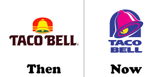
The Taco Bell logo is among the world’s most popular and instantly recognizable restaurant logos. It has undergone several modifications throughout the years.
The “classic” Taco Bell logo was introduced in 1985 after the company experimented with two typographic logos in the beginning. This version remained in service for almost a decade and some locations still use it to this day.1
The current version of the Taco Bell logo was introduced in 1994 and consisted of a modernized, slanted and more playful version of the chain’s classic logo. Taco Bell’s current catchphrase is “Live Más” which means “live more”. It was adapted in February 2012 to replace the old “Think Outside the Bun” slogan.
Colors of Taco Bell Logo
The Taco Bell logo features bright shades of blue, pink and yellow to appeal to its young customers. While the blue color stands for approachability, excellence and grace, the pink depicts youthfulness and1 affection. The yellow color, on the other hand, symbolizes happiness, optimism and joy.
Font of Taco Bell Logo
The Taco Bell logo features a custom typeface designed specifically for the company
BURGER KING
Burger King is the one of the largest and most famous food chains in the world today. The company was originated by James McLamore and David Edgerton as Insta Burger King, in USA. The Burger King logo was introduced in 1967, and almost looks the same; a rounded figure with tilted fonts painted in catchy colors. The logo consists of two halves of a bun with the name of the company in the center.
The Burger King logo has remained increasingly illustrious at all times. The initial logo contained ochre colored buns with a dull blue swoosh, which later altered to bright blue, and then was changed back to a dull blue all over again. The ultimate Burger King logo is circular in shape with reddish-purple font color.
DESIGN ELEMENTS OF BURGER KING LOGO
The Burger King logo demonstrates an alluring and vivacious image of a fast food restaurant, which is ideal for the fast food culture amongst the teenagers. The sparkling colors used in the logo are vibrant enough to draw attention of the spectators.
Shape of the Burger King Logo:
The Burger King logo appears as a tilted round figure with bun halves on both sides of the logo and the font is inscribed in the centre with a whirl, showcasing the entire logo. It accurately projects the sparkling features of the company.
Color of the Burger King Logo:
The three colors utilized in the Burger King logo are red, yellow and blue. The exquisiteness of the three basic colors forms a striking symbol adequate enough to pull people towards it, irrespective of their ages.
Font of the Burger King Logo:
The font used in the Burger King logo depicts clarity and simplicity. It is burgundy in color with capital letters enclosed in the circular shape, between the half buns. The logo is very exceptionally attractive and eye-catching. The font size of ‘KING’ is a little bigger than that of ‘BURGER’, enhancing the beauty of the logo.
The Burger King logo, besides being the most recognized fast food chain emblems and representing one of the most popular food chains, also managed to retain its standardized look throughout the years. The logo is simple in design and is eminent not only amongst the youth, but also appeals to the adults. The emblem has proved to be a guarantor of the quality and goodwill of the brand.