TV Unit MYP Vision mixer - Jonathan Chow
For the past 4 months, we have been tasked to find, explore, and create a polished "pilot" orientated "television show" in our group for our TV unit, whilst answering “What Impact has Developing Technology had on the relationship between the Media and the Audiences.” The techniques used in our final product and the cultural studies learned will be recorded in this portfolio
What is a Vision Mixer?
A Vision Mixer works very close to the Director, There job is to cut the camera shots using a variety of transition methods, such as cuts, mixes, wipes and frame manipulation that the director wants onto the live output or screen. A Vision Mixer is always watching and focusing on the preview monitor. Whilst the director is aware what is on screen, the Director is not necessarily focused on what the other cameras are doing. The Vision mixer is scanning each shot, knowing when to improvise and go out of script. On studio-based programmes, Vision Mixers work in the production gallery, on outside broadcast they are based in the mobile production gallery in the outside broadcast vehicle.
'MAKE' ANALYSIS
In the TV make with Martha Stewart, a colour grading of warm colours, which includes red, orange and yellow contrasts well with the theme of the Christmas episode. The colours used are utilised to create warm ambience, as if you have walked into a room with the the inviting fireplace. The set where Martha Stewart is introduced embodies a normal house. This puts an extra layer where the audience and Martha Stewart can connect intimately as if we’ve walked into her house. Glass paned windows, shelves of Christmas knick knacks life nutcrackers, spice bottles, candy canes, festive coloured candles all set in front of a green wallpaper makes it feel like Santa’s workshop. Martha Stewart contrasts with the set by wearing a classic rich burgundy outfit to anchor the holiday spirit. Martha Stewart commands a presence where she exudes confidence, not in a standoffish way, but relatable like a mother
The opening scene of the make sets a very basic instructional tone for the rest of the show. It is very inviting, easy to do, and child friendly. Winter Scenes with the animals layered with the Christmas jingles enhances the seasonal festive atmosphere.
Martha Stewart is the guru of food, recipes, interior design and kitchenware. So this segment of the show is the make. She often stands behind a desk or kitchen table with an appropriately designed set with many of her trademark cliched decorative props with the cinematography done in her formulaic style.
The elements used in the craft are positioned are arranged in the order of how the craft is made. That means, the paper used to make the cone is closest to her, next to that is the cone shape, then the paper muffin liners and the furthest away from her is a trio of the finished product made in different heights.
Complemented examples of the make are put next to Martha Stewart so that there is a smooth transition from one step to another as she explains the steps to making the craft. It also makes it easy for her to not lose that eye contact with the camera, making it seem life she’s having a conversation with us, and there’s no distraction bothering the audience during the make, and it makes it easy for the cameraman to shoot and focus on the subject.
There is only one presenter as it is a pretty straightforward craft, so that the audience doesn’t feel overwhelmed with any difficulty of the make.
Martha Stewart is an older person who exudes years of expertise, confidence. If a young person were to do this craft, I wouldn’t feel the same sense of measured poise, because a young person might be going off on tangents, speaking very quickly. She has a slow cadence in her speech, she chooses words like “lavish”, “beautiful” to punctuate and convey a soothing message.
The language in the script includes a lot of positive adjectives that are very encouraging, because it talks about how the craft can be a gift for your boss. She embodies good sensibilities, great taste. Martha Stewart has established as a motherly figure, where mothers and children alike can look up to her, for advice where it pertain to cooking, home interiors and food.
There are basically 3 types of shooting angles used in the make. The first shot is the safety shot where Martha Stewart is centred in the centre of the frame. In this shot, it includes the props, the ingredients, the background, and her torso and above. This shot is used best when Martha Stewart not demonstrating any steps but is instead engaging the audience with the context of the make. The next type of shot is the Right side shots, which are always close up shots, either of the props, her demonstrating a technique or showing her body language. This is the most prominent at the beginning because Martha is situated on the right side of the table. The third type of shot is the left side angles, which is mostly composed of close ups and medium shots of Martha Stewart’s demonstration or pointing towards the finished craft. This is used spice up the show, so that the audience is not bored with the same one or two angled shotsCutting from one shot to another represents the next step of the craft. Close ups feature the more difficult parts of the make. It is broken down into seven steps, 1) drawing the curved line with the pencil and a string, 2) says to cut out the cone 3) telling us to glue the cone,4) trimming out the centre of the muffin liners 5) showing how to apply glue on the inside curve of the ruffles 6) examples of how to glue the ruffle on the cone in several layers especially towards the top 7)rinse and repeat of the steps. They are shot in succession from one shot to another and focuses on the finished product.
There are 3 segments, the intro with the title card and winter scene, then the demo for making the whole craft, and lastly the final finished product with a little sponsor from Starbucks coffee beans.
WEST WORLD ANAYLSIS
In my opinion, there is no other word that can describe “Westworld”. It is beautifully shot, brilliantly directed and captivates the audience within its universe. Westworld follows many storylines, all of them happen within the paradise called Westworld, where the rich languish in a world where they are invincible and possess godlike powers. They can be the heroes of the story, or the villains, or bounty hunters without a cause. They can gamble their money or days away, or they can satiate their insatiable lust; there are no limits to their morality. In some ways, this TV show ties in perfectly with advertisement and TV because it allows us to feed our diversion needs; the world in Westworld and the show itself comments about escaping our everyday mundane lives, and it delves into into the metaphysical of what iit means to have a purpose in life. The TV show addresses our surveillance need where we engage with media to educate ourselves and it explores our personal identification need where we try to emulate the strengths of a hero. Westworld opens with an interrogation scene of Dolores Abernathy(Evan Rachel Wood), a robotic actor, or “host,” at the Westworld theme park. She exists to entertain guests, lives out the same story over and over again, waking up with no memory of the horrors she’s been put through to satisfy the dark predilections of Westworld’s rich clientele. At first we are meant to believe her sweetheart, Teddy Flood (James Marsden) is a return human customer (“newcomer”), coming back for a new vacation adventure with the same old flame. But to the surprise of the audience, Teddy Flood is just another robot. His entire purpose is to give a sadistic human customer the thrill of killing a woman’s husband before raping her. In the West World premiere, this sadistic customer is The Man in Black (Ed Harris), a customer whose cruelty pairs with a complicated plan to strike at the heart of Westworld.
Westworld also uses popular trends to advertise its previews of behind the scenes shots. Sometimes celebrities would take part in dubsmash where they lipsync to popular memes, on quotable one liners to pop culture music. HBO always has a promo trailer after each episode. The director Jonathan Nolan indulges in the fact that his advertisment campaigns and marketing schemes always break the fourth wall. For example, in the Westworld official website, the audience feel like they are actually visiting the real life amusement park of Westworld. Often, instead of positioning itself as a make believe TV show, the background information feels like an actual theme park in real time. In fact if you look through the coding in the website, you can find little sneak peaks of where the show is heading For example, when the show was about to premiere, you could find an additional teaser promo that tantalises the appetite of the viewers. Another example would be the hint of a location of a missing character working at Westworld, prompting the fans to theorize on possible story developments. Speaking of theories and feeding the appetites of the viewer, the producers of Westworld often drop hints of the future installed for Westworld, keeping the fan base of Westworld addicted, while many Youtubers and Subreddit citizens churn fan theories, produce analysis or philosophy videos. This is all free advertising hype even though there are no official trailers or episodes being offered by HBO. Nowadays TV shows are not about the storyline, but how the fans can interact with the story. The writers respond to what the fans want, so this has become a new dynamic where the audience feel that they have a vested say in the story; it becomes personal, on an active first-person basis.
Final Make Evidence
For my role in tht TV make, I was tasked to make graphics and animations for our film
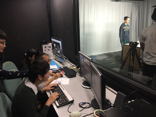
For the past few months, we have been assigned to make a TV Make. We needed to put all our knowledge into practise. I was assigned as the vision mixer of my group. The topic of our Make centred on how to make slime. We chose this because the product was easy to make, and interesting to viewers of a younger age group, I had to design graphics for my group that coincided with the topic. For example, the graphics have to relate to the show’s premise and originally without a lot of guidance from my director, I had to make up a name for the show before Chinese New Year. Because I was the only one working with creative decisions over the working title of our group, I named it “Slime Time” because it had a catchy attention grabbing edge. After CNY, I made a very simple build of the graphics where slime would drip down the screen to reveal our group name and a very basic logo which could be seen above.
After CNY, I showed it to the Director and instead of having a solid background, she wanted a moving background which was difficult to make because the visual effect of slime moving down continuously doubled with moving background would have been out of my technical reach so I kept the concept of having a moving background but changed the liquefied effect to a transparent black which would not have distracted the audience and is visually appealing. The Director was not satisfied with my idea so the 6 hours that went into making the moving background and the 2 hours used to make the slime effect and the one hour of rendering was all thrown away. I then sat down with her and in my mind, I was thinking a lot about the John Hughe sci-fi films life Weird Science where my group name was derived from, Rick and Morty and Back To The Future. These title cards used notions of wacky science to animate their title cards and I absolutely loved it and wanted to emulate the effects for our group’s make.
My title card seemed like it was a continuous TV series although we only had one episode, so if I wanted to, that idea could have had the flexibility of being expanded into multiple episodes. I explained my vision to my Director, that there was going to be a conical flask and as the video would go on, bubbles would start rapidly increasing. At a certain point in the video, the conical flask would explode and Weird Science would pop up on the screen, which she thought was a good idea too. For the bubbles, I used a composition where a circle would jiggle from left to right imitating the movement of the bubble and over a period of 5 seconds, the bubble would pop into lines life a cartoon effect of an explosion. I then drew the conical flask with a transparent layer so that it was easier for me to add in the mask. For the mask, I used an effect called Liquefy, and over time, the mask would increase in size, having a wavy outline paired with the rising bubbles effects that I had made,which popped at different times to give it a more realistic effect. The visual cues also builds up the expectation within the audience that something big is about to happen. The Title Card for the intro was really easy to create; I used a gradient blue background and a pre-made shape in photoshop mixed with polka dots as my title card which took about half an hour to create.
The make itself on the day was fairly simple. Although I had some criticisms, for example, a lot of the shots, I had to put input to the director and cameraman because some of the props on the table in how they were set up had no influence in the final make and it was just a waste of visual space and decreased our flexibility in putting the camera closer for more interesting positioned shots. Karina, Athul, Lorenzo, Aryan, Chester and Ann all played their roles perfectly and I had no criticisms of their work; they were very patient, flexible when changes needed to be made. I understand the difficulties Herbert had as a cameraman, because he didn’t get a lot of input during rehearsal and setting. So when it was time to shoot the final take, he was not fully on board nor on cue and many of his shots were almost unusable and not focused. He kept on shaking his hands so actually had something that looked life the Blair Witch Project or Cloverfield. During breaks between rehearsals, he was messing around, but that could be because he has a short attention span. As for myself, I was very slow cutting from clip to clip, sometimes I cut off Lorenzo, the presenter either because there was a miscommunication between me and the Director and me assuming that Lorenzo was about to finish a sentence. I had put in a lot of work into the sting, with minute by minute progression and had assumed that the Director was fine with it, but only found out at the last minute on the day of the shoot that she had dropped all my ideas and stole my background without the slime effect.
In conclusion, I think our Make was successful despite the bumps on the road ahead. I hope that I can revisit this unit as I do enjoy the creative process and filming a lot.