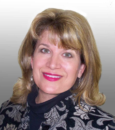
HI! I'M JULIE TERRY, A MARKETING COMMUNICATIONS PROFESSIONAL.
I have experience in: Public Relations, Marketing, Graphic Design, Campaign Planning, Art Directing, Branding & Identity, Multimedia, Social Media Marketing, Photography and Image Editing.
This is a presentation of some of my work.
I love what I do - because Creative Works!
Photo Retouching
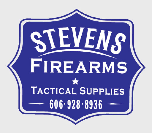
LogoS
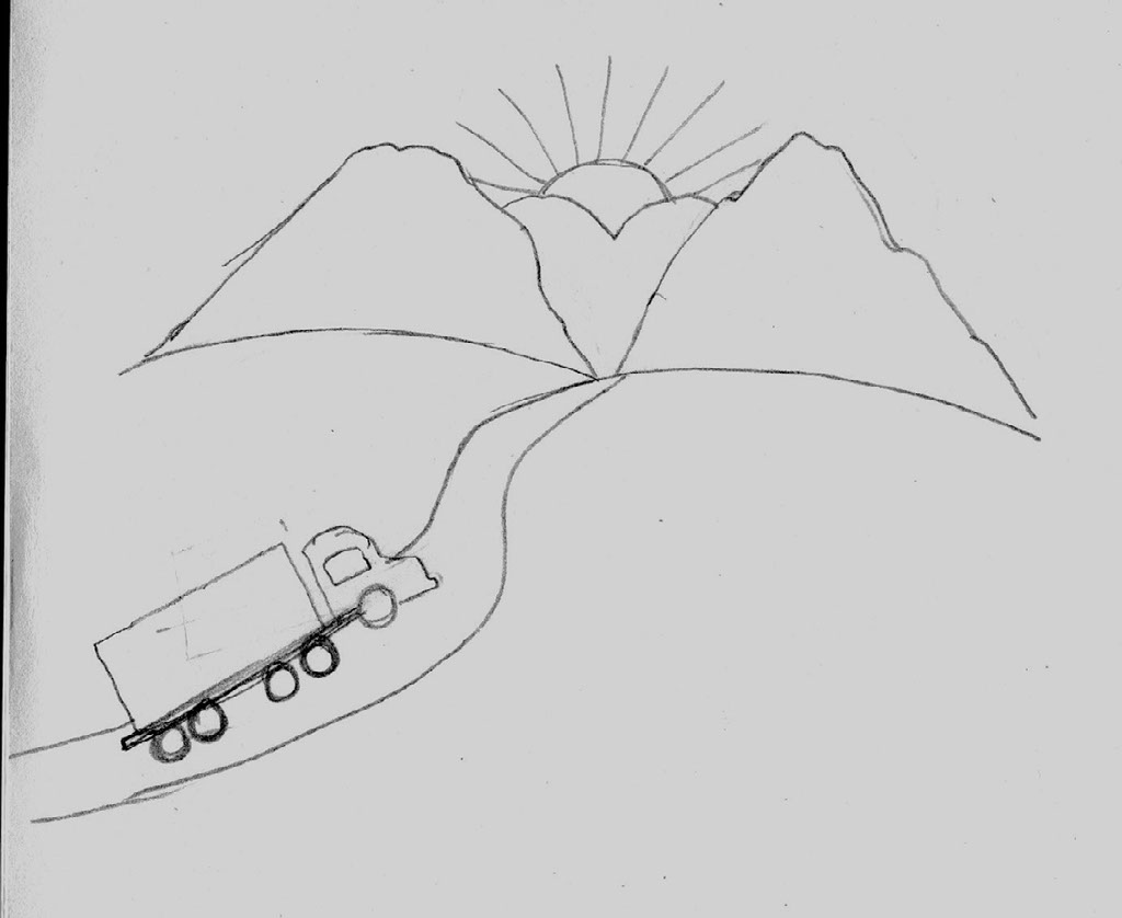
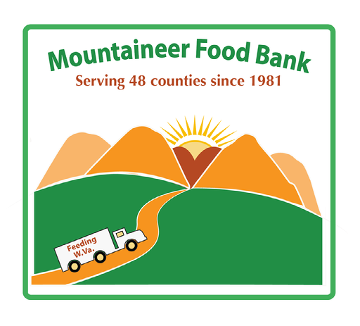
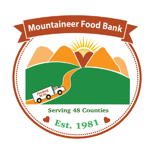
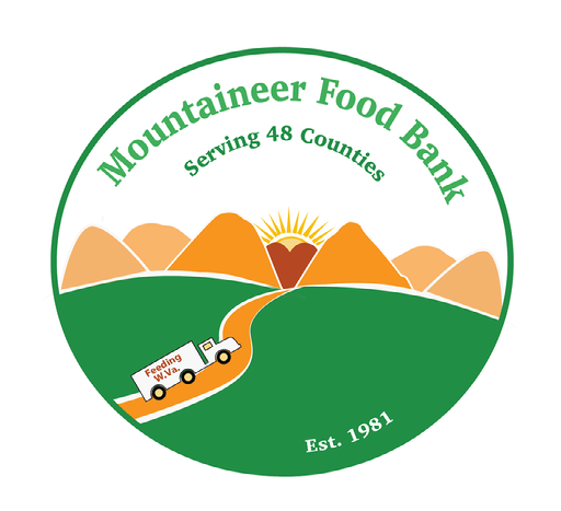
Mountaineer Food Bank sponsored a statewide contest for a redesign of its logo. They wanted something simple, scalable and usable in a variety of media. The requirements: use orange somewhere in the design, and include mountains and country roads. They also mentioned it would be nice having a truck in the design, since they transport food via truck to 48 counties in West Virginia.
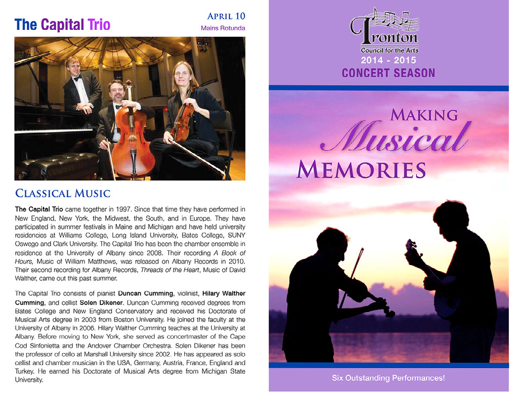
Ironton Council for the Arts
I was a designer and PR consultant for the Ironton Council for the Arts from 2000 to 2014.
When I first encountered the Ironton Council for the Arts, it had no logo and did a poor job promoting itself. I volunteered to market the organization. I created the logo, season brochures, posters, flyers, press releases and submitted concert announcements and performance reviews to the local newspapers. I convinced the organization to start a website and Facebook page. It was exciting to see resulting higher season ticket sales, larger audiences and greater visibility for this all-volunteer arts organization that offers outstanding music and performing arts events.
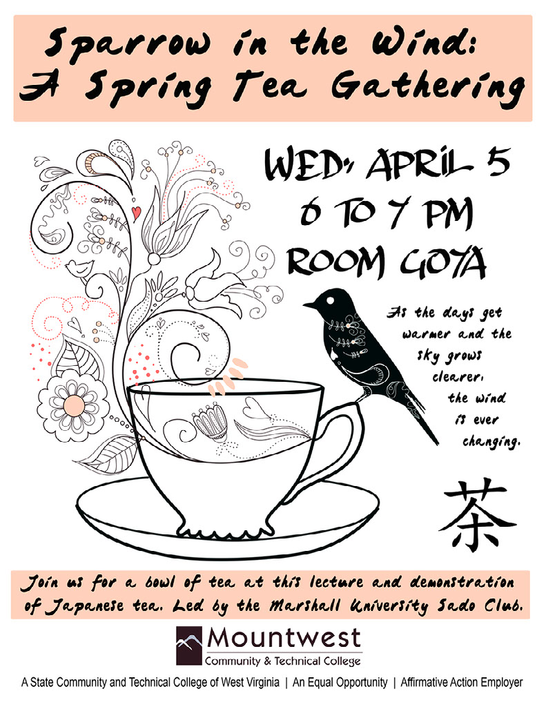
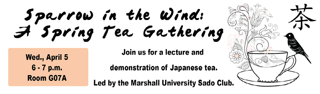
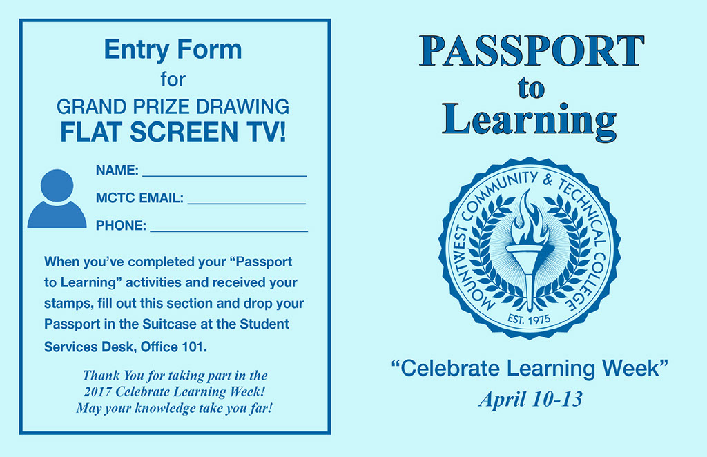
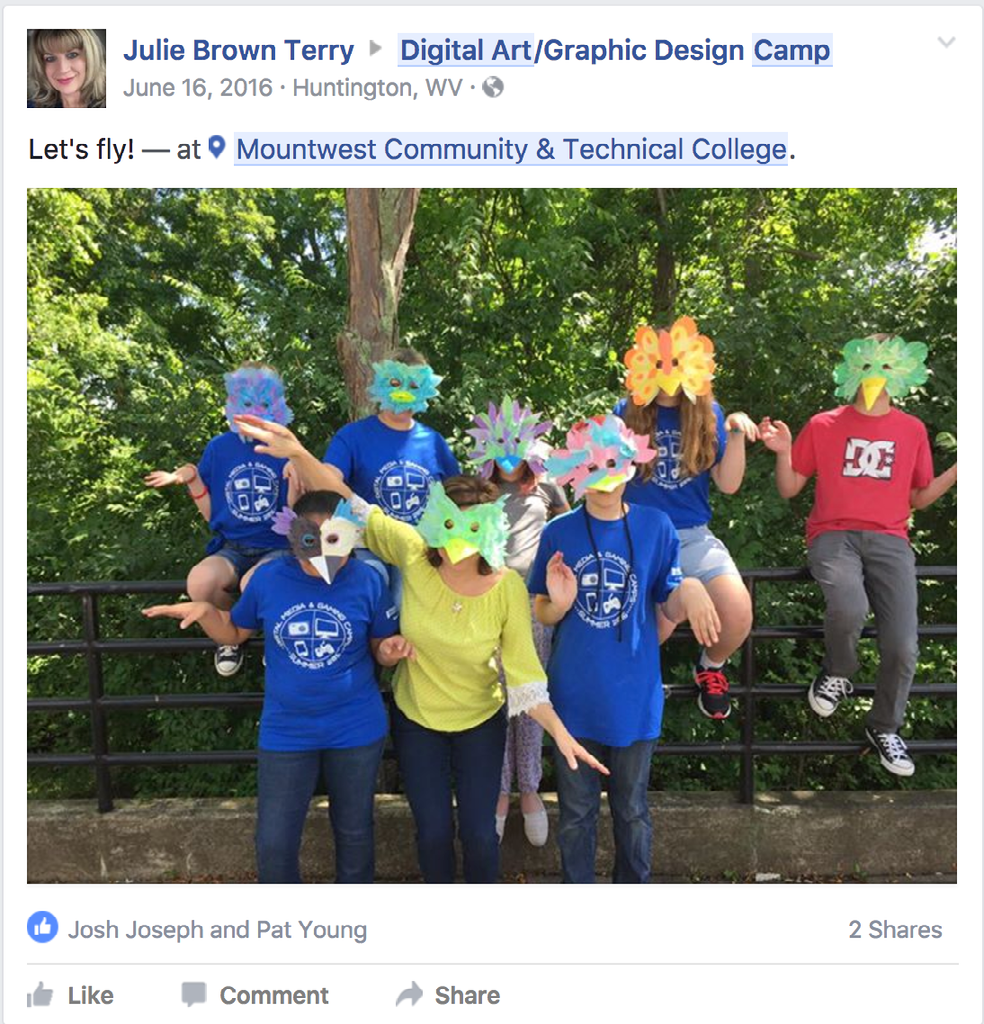
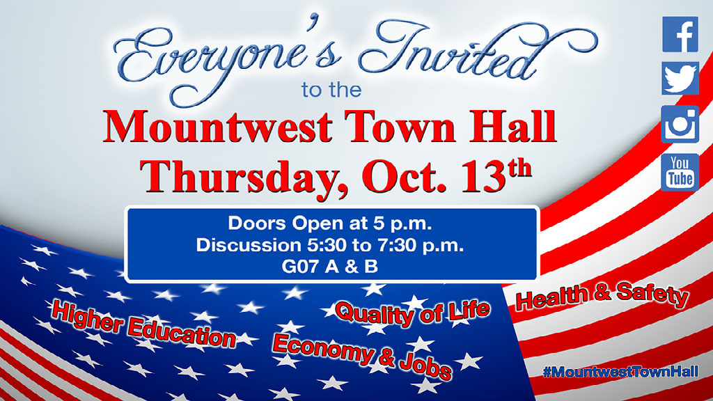
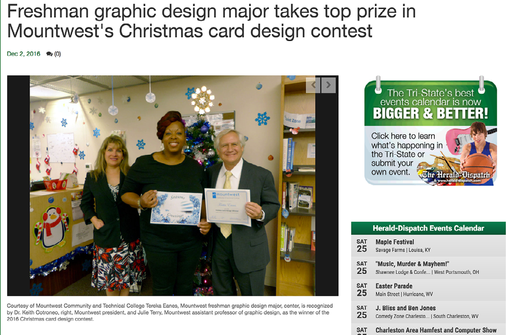
Mountwest Community & Technical College
I've been a full-time Assistant Professor at Mountwest Community & Technical College since August 2014. I was brought on board to establish a new Graphic Design associate's degree program.
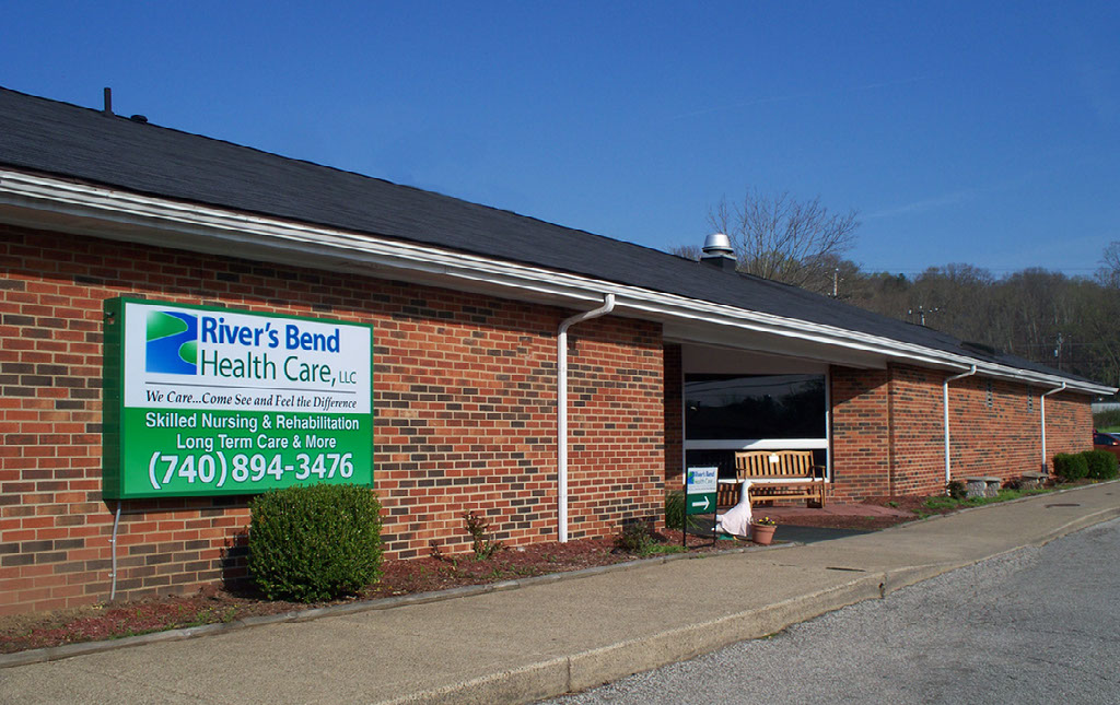
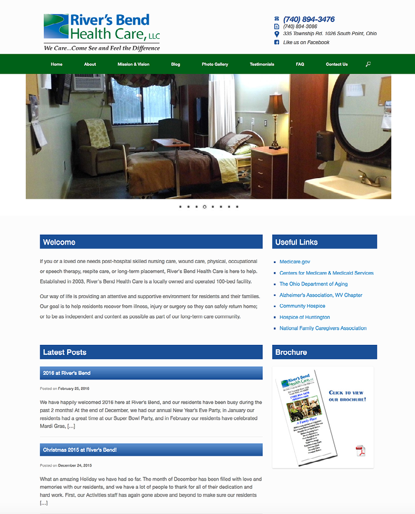
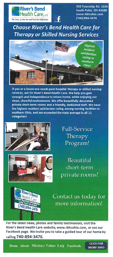
River's Bend Health Care
I was Director of Marketing and Admissions at River's Bend Health Care, a skilled nursing and rehabilitation center, from 2011 through 2014. This family-owned business needed branding, marketing and community outreach - which I provided with great results.
I had a lighted sign with the new logo placed prominently on the front of the building. I also had a large lighted highway sign installed near a major roadway and smaller directional signs placed on the streets to help people find the facility, which is tucked away in a neighborhood.
I worked with a developer to create a web page for the facility, since it didn't have one, and was hard to find on a Google search. I took photos and created content for the site.
I established a Facebook Page and YouTube Channel for River's Bend.
Here are several of the TV spots I developed to promote River's Bend. I coordinated the testimonials and scenes, wrote the scripts and oversaw the shooting and editing. I posted the ads to the YouTube Channel - unfortunately the screen resolution and sound are not ideal.
I recorded events and entertainers for the YouTube Channel to show that River's Bend is a lively, fun place, where residents are up, out, and involved in numerous activities.
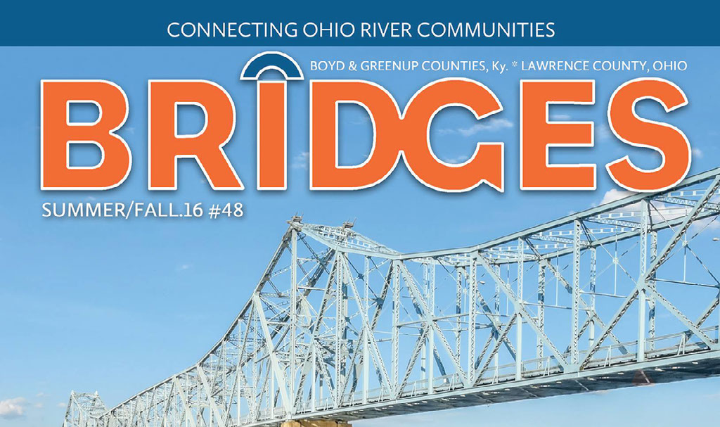
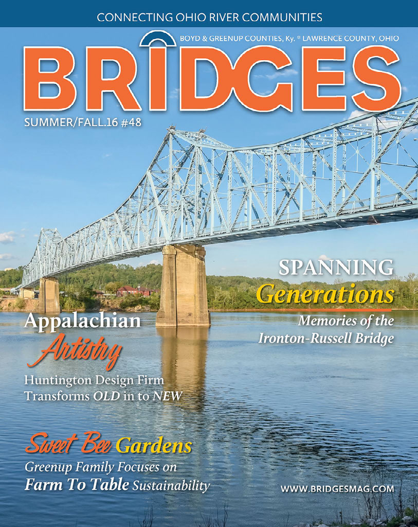
Bridges Magazine
I've been a writer and photographer for Bridges Magazine since 2010. I pitch story ideas to the editor about interesting people and places, business leaders, and things going on in the region.
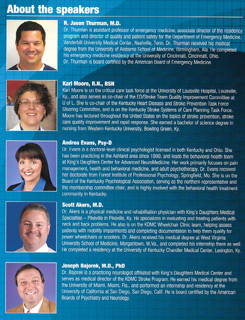
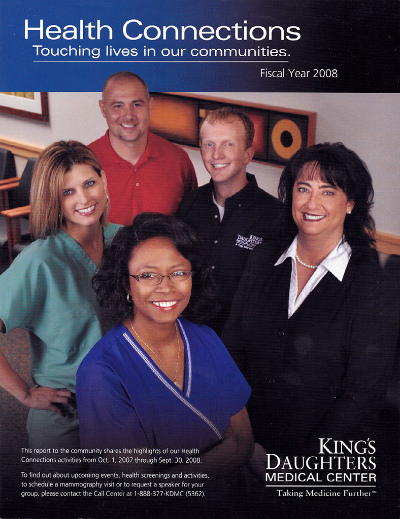
King's Daughters Medical Center
I was a Marketing/PR Specialist at King's Daughters Medical Center from 1995 until 2010. I was there during a period of dramatic growth and prosperity, as we repositioned the company from a small-town hospital into a major regional referral center. During my tenure, KDMC built three major expansions to the main building, added 12 off-campus facilities and brought new medical specialties to the region .
I was part of a group that served as an in-house creative team for the hospital. We did a lot of the creative ourselves, but also worked closely with advertising agencies on major projects.
I did a wide variety of work for KDMC - spokesperson and media relations, community relations, special events, continuing education conferences, corporate communications, video and radio production, marketing and advertising.
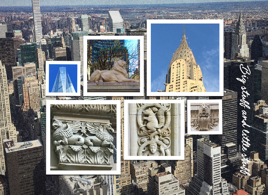
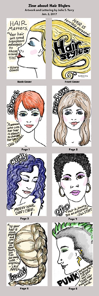
Personal Expression
Just for fun! Here are a few projects I've done for personal enjoyment and creative exploration.
Credits:
Artwork and many photos in this presentation are by Julie S. Terry.