First of all I would like to thank you for choosing me to present the treatment for this very enthusiastic yet very neat and stylized campaign.
Overall Approach
This film has the potential to tackle its main message and tactical concept in a very light and fun way that sets the audience automatically in a good mood to absorb what we have to say and learn about the product. Being a mixture of a musical with a broadway feel to it and a sense of a fashion show, this all puts the commercial in a niche position. For me the Chanel reference is a perfect reference for this copy, making it to the point! And since the colors and neat look here are our first attraction this commercial is already distinguished from all other ads.
The mood and look will be set perfectly as soon as we start with the interactions between the props and our three main characters, followed by the Brand Ambassador's performance with her assistants. We will have a choreographed performance that does not involve dancing but rather a tactical movement that is staged and has a broadway feel to it. Our hero is definitely the art direction of the supermarket as we are planning to stylize all the items along with the flashy wardrobe of the three main women and the supermarket staff lady at the end.
What also needs to be highlighted to give the copy a unique mood is the choreography that will be staged in a theatrical broadway mood that will give the copy a sense of dynamic keeping it always on the move.
Look & Mood
The film has a great privilege which is the COLORS! They are catchy from the first minute, starting with the art direction along with the costumes and props. This will give the look right away for the viewer as mentioned before. The mood will be achieved by creating a certain era from the musical song used that will trigger the characters to start with their choreographed actions that will be enriched with the camera techniques and lighting that will be discussed in a bit.
Camera Movement & Technique
This copy is all about the details! That's why I think we should approach it as if the viewer is simply zooming in when it comes to wide shots in the supermarket to medium and close shots of the characters. This gives them the time to see the art direction, the wardrobe from wide to close. The camera will follow the characters in possible sequences in a one shot way and the rest will be "cutty" shots as we are limited with our 30 second copy.
There will be a lot of track movement camera for this copy. Also we will be having a variation of angles , depending on the set that we will be able to create; differing from high angles for the opening shots, top angles for the choreograph movements, medium and close shots for the women talking or singing, and low angles for introducing the ambassador, playing around with various angles to give this copy the energetic feel that it needs. The continuity of the movement and the harmony of the choreograph will make the audience not feel that we're cutting a lot and makes them wanting to watch it again and again to capture all the details.
Location
Choreography
In this part I feel like we should give the viewer the impression that it's a musical on a "slowly cooked plate" meaning that not from the start we will make the video very dynamic but rather introduce the character in a cinematic, fashion-show alike way by having the characters move in a certain way around the shop. We will start introducing each character after the other while they interact with the props and move in a harmonic choreographed moves.
We start introducing our location and show the characters with the effect of each character appearing from behind one another, giving a sense of repetition to the same action taking place (purchasing oil).
We will then see the characters crossing path and interacting together around the shelves in a harmonic choreograph.
Suddenly we see the Brand Ambassador appearing, back lighted from the fridges light in the middle of the allay like walking on a cat walk. She states her message very confidently and pleasantly, grabbing the attention of all women.
Then we introduce the assistants, coming from another angle, crossing over with their plates more dynamically setting a higher mood for the copy. We get to see some flashy choreographed scenes between the Brand Ambassador and the assistant.
From the top shots of the moving plates and the assistant's faces, comes the transition to the demo with that shot.
We then cut back to a final grand scene that shows the whole cast approaching the camera in a well choreographed composition, unleashing the final wide look of our location. This will be a very nice ending to our show showing the women's shopping bags that has our product Shams.
This would be a good reference for the women carrying the plates and trays at the very end of the commercial.
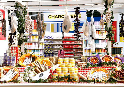
Art Direction & Props
Since this is our main hero this means we should give too much attention when it comes to the order and colors of the art direction and set up for this part. Meaning that the organization of the shelves in addition to the harmony of colors has to be very visible to the audience. All props including the plates and shopping carts at the end shot, need to look very customize and untraditional to what we see in normal supermarkets in order to match our fantasy supermarket look. All products will not be real and will look neat and very stylized.
This will also be shown with our lighting, where we will see an interaction between the light bulbs on the shelves and fridge in contrast with the props. By having the lighting and high intensity this will show the contrast perfectly. We need to show how stylized everything is and how the contrast of colors between the background (art direction) and foreground (character) looks so outstanding from one another. We can also have the
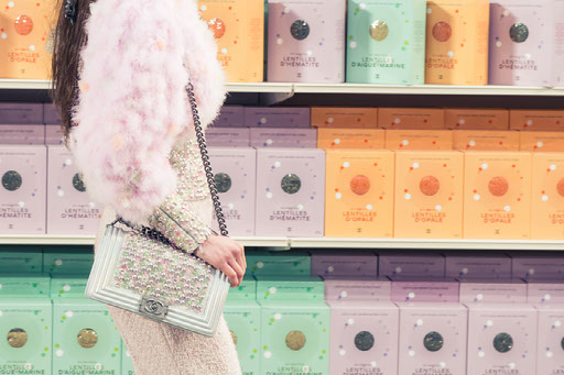
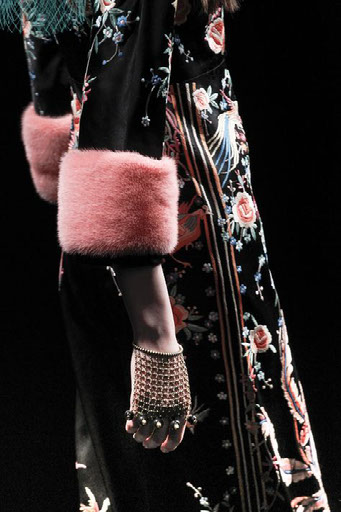
Wardrobe
The wardrobe part will mainly be caring the main colors of our logo which are yellow, orange and green. I prefer to have the three ladies dressed in, yellow, orange and green then the final Brand Ambassador lady at the end should be wearing a very stylized and the assistants will wear uniform in order to stand out. The accessories plays a very important role here, it has to be flashy and very up to date like designers bags and big bold sunglasses or clutches. They need to give the impression that they are very neat, fashionable ladies who have extreme awareness of their looks and style.
Cast
The cast here will only be visible through their faces, so we need fresh looking women with mostly natural beauty and heavy makeup but not smokey looks but rather flashy nude looks with a sense of color to each one of them. They have to have their own color identity and match everything accordingly. For example miss Orange or miss Yellow has to have everything covered up around this color scheme.
The Brand Ambassador has to look very stylized, charismatic and being the face of our product and should look very pleasant and smart with very sparkling eyes and good acting skills.
Cast has to be also flexible in terms of how they will be choreographed and the ability to absorb the movements. They also have to be pleasant and fun to match the overall mood of our musical.
Music
As this is mainly a musical commercial, the music plays a very important role. I think the music reference of Mozart is a great and smart choice! What I think will be also a good idea other than making the lighting and choreographed moves of the character sync with the song's rhythm, I also think that if we use a cover music of the selected Mozart track since we will be composing the track again. I think this will be a good idea to give it a more modernized style, something that has more arabic fusion violin or drums to fit the niche and stylized mood that we have set for this copy. The most important thing will be having this composed track ready before the rehearsals of the cast to make sure the choreograph is aligned with the rhythm of the track.
Grading
As this copy is very colorful one has to take this into consideration and take the chance to stress on these colors in the post because it's not everyday that you come across a project that gives you the freedom to enrich and stress on its colors. That's why I feel that making the copy look flashy and in complete colors is one of our strength point here that grabs the viewer's attention right away!