This was a great overview class in the field of User Experience design offered by the Adobe Education Exchange. Please enjoy my process which starts with Assignment 1 below my final reflection.
Note to the instructors: The What is UX video appears in the Orientation Class hub on the class site. The link and the video's password are there.
Final: Reflection
What I learned: I was very happy to learn new processes and build upon ones I already knew.
As I mentioned in Assignment 5, learning to create the live prototype was truly a highlight of the course. I was quite grateful we could use Powerpoint. Seeing that Powerpoint has the capability to create functional prototypes was eye opening and expanded my knowledge of this software. I am thrilled to share this newly acquired knowledge with students and colleagues alike. As I primarily teach design foundation classes, I will be adding a Powerpoint demonstration component to my Graphic Design 1 and other classes I may teach. In terms of sharing this knowledge with my colleagues, I will propose a professional development workshop where I will demonstrate my newly learned skills.
Again, as I shared in Assignment 5, I was quite happy to develop a solid research process for User Experience and User Interface design. I had never appreciated the critical influence thorough research has on creating a product for users. Interviewing subjects and walking through their use of the product presents so much insight into the design and development phases. I was very taken aback with how critical language and nomenclature affect a user’s experience with a product. I will add a section in my lectures to address how important language is as part of the design process.
Assessing my work and my approach to completing the assignments: Like I said in Assignment 5, although my end product is simple, and a bit anticlimactic, the information gleaned from this process is invaluable. Learning from the failures that happened along the way was monumental.
Preparation and allotted time are two important parts of a process that must be emphasized. I found I did not allow enough time for Assignments 3 and 4 in respect to crafting user interview questions. Because of this fact, my user testing was off. My premise, which was to create a non-linear navigation structure for “member” users wanting to access records/statements of their office visits on the Kaiser Permanente web site may have been too limiting also.
Learning outcomes: In my Multimedia Content and Form and Graphic Design 1 classes, I have fundamentally covered the definitions of “Persona,” and “User Experience.” I have not distinctly discussed “User Interface” design. I feel both User Experience and User Interface design should be covered more thoroughly in classes at the next level of those I teach.
Here are some other learning outcomes I will look at incorporating into my classes:
- Understanding basic UX and UI terms
- Understanding the basic UX design process
- Understanding and building foundational user research best practices
- Creating a functional live prototype in Powerpoint
- Understanding team research and collaboration
Overall, I am confident in building on what we learned in the course and applying it to my teaching and my professional work.
Assignment 1/Problem Statement + Personas
Problem: There is no way patients can acquire online copies of their office visit receipts via the Kaiser Permanente web site: kp.org.
Observations:
- When I arrive to an office visit, I must decide to accept or decline a paper receipt after I pay.
- Over the course of the year I found I had a folder full of receipts. I could shred them; however I found I wanted see my costs by the end of the year, so I held on to them creating a needless waste of paper.
- Since I do the majority of my out-of-office interactions with Kaiser’s website, I would like to develop a section where patients can view and retrieve their office visit receipts as an add-on section to the Pay Bills portal of kp.org.
- This will eliminate paper waste and grant users more control over their documentation.
Personas
What is a Persona: "A persona represents a cluster of users who exhibit similar behavioral patterns in their purchasing decisions, use of technology or products, customer service preferences, lifestyle choices, and the like. Behaviors, attitudes, and motivations are common to a "type" regardless of age, gender, education, and other typical demographics. In fact, personas vastly span demographics." Source: Ux Magazine
Assignment 2-Research + Sitemap + Wireframe
Problem [Revised]: There is no clear way patients can acquire online copies of their office visit receipts via the Kaiser Permanente member web site: kp.org.
New Questions: 1. Did you know you can see your office visit expense records on kp.org? 2. If yes, where do you access them/What link do you first click? 3. What link do you next click? 4. Are the link labels clear enough where you confidently know you can access the office visits information via them? 5. What are your thoughts, if any, on how Kaiser can make accessing this information clearer?
Observations [Video]:
- I interviewed a person who fits my “Techfemme” persona, asking her to walk through the website making note of her steps to find the screen housing the office visit costs documents based on the new questions shown above. As my site “user” navigated kp.org in search of the office visit receipts, one major issue arose with the nomenclature or naming process Kaiser implemented on their site. Kaiser uses a number terms that could mean the same thing. This was quite disconcerting and confusing to the “user.” There is redundancy in some of the naming structures also. The “user” felt implementing a clear naming protocol for the pages would aid greatly with user navigation.
Three examples of unclear nomenclature that could cover office visit records: • Claims Summary • Out of Pocket Summary • Medical Bills
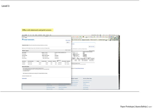
All three links are found first, on the My Coverage & Costs second level page. However, the user expressed great concern about not clearly understanding from these terms if she could get to the office visit costs page. I was quite taken a back by her statement that she did not understand the “language” Kaiser is using on their site. Her first choice was to click on Medical Bills. However, this page presented a PDF to download, and was a summary of all the medical bills in one period. There was nothing here that broke down the individual visits and their individual costs. She then went back to the home page and chose the Medical Record link. Again, nothing covering office visit costs could be found. She then returned to the My Coverage & Costs page and just as a guess, clicked on the Claims Summary, and lo and behold, this is where the office visit individual records and their costs can be found.
This process took over five minutes. At the end, the user felt that it would benefit Kaiser greatly if they reworked the naming structure above any other needed changes that could aid the user as they navigated the site.
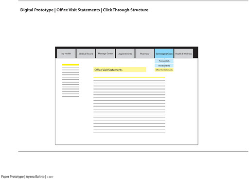
I am proposing a drop down menu be incorporated for all related page links. In the case of the Coverage and Costs page, the primary links in the drop down menu should be Premium Bills, Medical Bill, and Office Visit Statements. Also add the link name Office Visit Statements to the Pay Bills box under the Medical Bills and Premium Bills links. I propose changing the Claims Summary term to Office Visit Statements, as this nomenclature clearly identifies what the user is looking for.
This project does not involve screen/page redesign. It concerns presenting the user with a clear nomenclature and navigational structure. Note: After the video has played, click the "X" in the top right corner to close it and return here.
Assignment 3-Prototypes: Paper + Digital
Observations:
- I, again interviewed the person who fits my “Techfemme” persona, asking her to “click” through the pages to arrive at the page where users can find the costs for their office visits. Please note: the term “Office Visits” covers doctors visits, lab work, and other in-clinic activities.
About 3/4 of the way through videoing this process, the two of us got stuck with the terminology Kaiser has implemented across its site. The process of her attempting to achieve success at arriving to the desired screen was still encumbered by this unclear nomenclature, and she was unable to arrive at her desired goal. In constructing the paper prototype, I failed to change the Claims Summary header to my proposed Office Visit Statements header. This, too added to the user’s confusion.
In doing this exercise, I most certainly learned to better prepare my questions and make sure terminology was consistent for the user and what not to do when constructing the paper prototype. It is a fail, but given what was learned, it is a good fail.
Note: After the video has played, click the "X" in the top right corner to close it and return here.
Assignment 4: Mood Board + Style Tile + Layout
For the final project, I chose not to deal with redesigning Kaiser Permanente’s member website kp.org other than to make a structural change to the top global navigation for UX/UI purposes. For this exercise however, I have made some note of where Kaiser may want to review their site’s visual design.
Before login, the Kaiser Permanente member web site’s landing page is quite beautiful and engaging. Upon logging in, it is rather visually sterile. It uses blue on the index page with a small header image. It has two linear navigation structures linking to the second level. Note: There are screenshots of the current kp.org index and second-level pages in my Class 3 Assignment.
Once one starts to move through the site, they are presented bland text-laden pages with text hyperlinks. Other than the KP logo and a search field and button, there are no images.
In searching for mood images I chose to focus on another health service institution—Dignity Health. When I watch television and a Dignity Health commercial comes on, I literally stop what I am doing to watch it. The visual messaging Dignity Health uses is warm and engaging, and communicates that they are a welcoming and caring institution.
Kaiser Permanente's member site would benefit greatly from a visual redesign with exploring a more robust colour palette and modernizing the typography and bringing in engaging images. Because the brand colour is this dark aqua blue, and the branding materials heavily use it throughout, the site should also use it and its variations in a more cohesive way.
In the Style Tile, I propose what colour palette, image and typographical styles they could consider. For the colour palette, I used Adobe Kuler or Adobe Color CC. This is a great tool for developing colour palette options. I used the “Compound” choice to create a palette that includes split analogous and split complementary colours to the Kaiser blue. The URL is color.adobe.com.
As my premise involved essentially no redesign of kp.org’s member site other than showing a drop down menu to afford the user a global, non-linear experience, I created a layout that cleans up the member index page using more white space, eliminating the secondary navigation grid, bringing in larger and engaging images, and pulling from the colour palette I created in the Style Tile.
Assignment 5: IA Prototype
Note: After the video has played, click the "X" in the top right corner to close it and return here.
Learning to create the live prototype was truly a highlight of the course. I was quite grateful we could use Powerpoint, as I have not yet subscribed to Adobe Creative Cloud, which allows access to Adobe XD.
I was quite happy to develop a solid research process for User Experience and User Interface design. I had never appreciated the critical influence thorough research has on creating a product for users. Interviewing subjects presents so much insight into the design and development phases. I was very taken aback with how critical language and nomenclature affect a user’s experience with a product. As creators, I feel we must pay more attention to this important aspect.
Although my end product is simple, and somewhat anticlimactic, the information gleaned from this process is invaluable. Learning from the failures that happened along the way was monumental. And I feel confident in building on what we learned in the course. I most certainly will apply all that was covered in my teaching and my professional work.
Credits:
Background © 2017 Ayana Baltrip Portrait © 2017 Ayana Baltrip All content, images, and media are the property of Ayana Baltrip | © 2017