SYNERGY
DEFINITION: The interaction/cooperation of two or more substances or other agents to produce a combined effect greater than the sum of their separate effects.
I think that the film trailer, poster and magazine for Hide N Seek all look good as individual products. However, when combined together they create a serious effect which emphasises the story line and the genre. This is due to similar themes such as colour, expressions and text. Synergy has enabled my work to make each product look even better and shows off different characters instead of just one.
MISE EN SCENE
In my poster and magazine cover, there is the same type of coloured clothing as well as the same background. The fact that there is the same background in both texts shows audiences that they are in the same location. Although this location is not used in my film trailer, it is clear to audiences that they are together due to things that occur in the trailer. I think this is a good way all my products are linked together because the magazine and poster reveal something that the trailer does not.
CHARACTER REPRESENTATION IN ALL THREE TEXTS:
TOM
Tom is the kidnapper in my film and he features on the film magazine as well as in the trailer. He is part in both of these as he plays a significant role in the film that will evoke certain emotions towards him from the audience. Such responses will include being scared and/or angry. This is because he is represented as negative throughout the film trailer as well as in the magazine. In the film trailer he is seen with little to no emotion and is clearly a villain. In the magazine he is also seen with little emotion, wearing dark clothing and directly addressing the readers looking very serious. If readers of the magazine have not seen the film trailer before seeing the magazine cover, it is clear that he is the villain as it is mentioned in the information about the main cover line.
This will give people a bad first impression of him and will come to watch the film trailer with a set of ideas as to what he is already like. People that have watched the trailer before seeing the magazine will view him as negative straight away without having to read the cover line first. The fact that similar emotions will be felt by audiences no matter what they have seen first shows that the combination of my main product and ancillary texts is beneficial in maintaining certain audience responses.
AMY
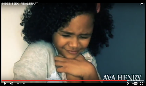
Amy is a very significant character in the film as she is the child that gets kidnapped. Having her on the film poster was essential for many reasons. One reason is that I wanted her to look sad and mistreated to evoke a sad and worried response from audiences no matter which order they saw them in (e.g seeing the poster before the trailer or the other way around). Another reason is that you don't usually see a child on a magazine cover unless it is a magazine for children. I did not want to go against this convention as I did not want people to think my film way less serious than it is.
She is pictured in different clothing to what she is wearing in the trailer as well as having a few faint bruises on her face. This as well as her emotionless facial expression will make audiences intrigued as to what has happened to her/feel sorry for her.
HANNAH AND ELLIE
Hannah and Ellie are not shown on the film poster or the magazine. Only seeing them in the film trailer makes them appear in a more positive light because they are seen to do no wrong in the trailer. Having them solely in the film trailer focuses the situation more on the kidnapping instead of Hannah and Ellie's reaction to it. I think this is a good point because having their actions to try and get Amy in the trailer would give too much of the story away instead of leaving a lot to the audiences imagination. I also prefer to keep the focus on the kidnapping because it is then clear to the audience what the story is about and why the film is called 'Hide N Seek'.
Hannah and Ellie appear very concerned in the film trailer and are also seen to have a good relationship with Amy as well as each other. This is nice to see for audiences and will hopefully make them grow to like these characters. Also, the fact that we see the good relationship between the three girls before the kidnapping occurs means we don't blame the babysitter for her disappearance as we are aware she is very fond of the girls as well as the fact that she was just playing a game that they wanted to play which did not seem like a dangerous game.
COSTUME
In the film poster and film magazine I feel I should have used the same costumes that the actors wear in the film trailer as this would have been recognisable for audiences and connect them all together. Also, I think that a kidnapper would not have changed the clothing of the child he has abducted so the fact that the child's costume as changed and she is now seen in clean clothes ruins continuity and seems a bit strange.
However, the fact that they do not match could also be seen as a creative point because as mentioned before, the background of the magazine and poster are in the same place showing the characters have moved to a location not shown in the trailer. This could possibly create a new story that the kidnapper is possibly changing the child's clothing to make her look like she could be his child. Furthermore, the change in the child's outfit reflects the mood. For example, the outfit is brighter and connotes happiness when she is very bubbly at the beginning of the trailer and her costume is more dark and plain when the mood is serious in the film poster.
COLOUR
Dark colours and shades are included in all three of my products. This creates a recognisable style and also hints to audiences of the seriousness of the situation as well as foreshadowing events.
CELEBRITY ENDORSEMENT
Each of my products include actors names. This technique is typically used with big names to help promote the film and attract fans of the actors to come and watch the film. Also, in a lot of cases (especially with independent films) actors names that are not so famous being advertised helps boost their career and entice people into exploring new and upcoming actors. I think using their names in my products really emphasises their importance and will make people want to see how these people act.
FONT
MAGAZINE COVER
On my magazine front cover, the text for the film title is bold, yet of a small font size. The font used is similar to the font used in the film trailer which I think creates a certain style that the film title can be recognised by. It also links everything to do with the film together.
FILM POSTER
However, I did not use the same font on the film poster. This font is very simplistic, not very bold and makes the poster look quite modern and less serious. This is something I would definitely improve if I was to edit the film poster again because it does not seem right to have different fonts for the same film title.
FILM TRAILER
This is a similar text used in the film magazine for the film title. This text appears on the film trailer with a booming sound. The combination of the bold text and the boom makes the film title stand out. I think if this was included in my film poster it would create the same effect.
Therefore, regarding font, all three of my products do not flow together yet other themes such as character representation and mise en scene can distract audiences from this fault.
PIRATES OF THE CARIBBEAN
To back up my points I have compared what I have said to Pirates of the Caribbean, although it is not of the same genre of my film, it is a good example to use when comparing the effectiveness of the of the combination of the main product and ancillary texts.
MISE EN SCENE
- We can see a lot of different locations in the film trailer, including the sea. The sea is then featured in the film poster and on the magazine cover. This links them together and reinforces the significance of the location.
- In my magazine and film poster I used the same location which links them together, however this location is not revealed in the trailer.
CHARACTER REPRESENTATION
- The whole situation in the film is based around Captain Jack Sparrow and this is why he is featured in all three products.
- The situation in my film is based mainly around the kidnapper and the abducted child. This is why they are featured on the film poster and magazine and of course the film trailer.
COSTUME
- Captain Jack Sparrow's costume remains the same but the clean and tidiness of it changes throughout the trailer. In the poster it appears a lot more dirty and it appears cleaner in the magazine. These slight changes add make the combination of all three products a lot more effective as it looks like they were captured around the same time and links them all together making them more recognisable to audiences.
- This is something I should have done with the abducted child instead of changing her outfit completely for the film poster
FONT
- We see the same font in the film trailer and the film poster when the title of the film is shown. However, we do not see this in the magazine as well as the fact the the full title of the film isn't included. In the magazine, the film is referred to as 'PIRATES 4' instead of 'Pirates of the Caribbean: On Stranger Tides'. Although I did not use the same font for all three of my products, it makes more sense not to use it on the magazine cover because it may ruin the style of the magazine. Luckily the font used for the film title fit in well with my magazine's style. Using the the same font on the film poster is something I should have done.
CONCLUSION
I have show to use that different aspects of all three products are effective in some ways. These ways include the mise en scene, celebrity endorsement and character representation. However, I have also highlighted aspects where I could have enhanced the effectiveness of the combination of my main product and ancillary texts such as costume and font.