Designing with Materials BY: Alyssa Ellerbrock
Cut-out Design Project
Element Cuts Vocabulary:
Asymmetry - A lack of equality or equivalence between parts or aspects of something.
Balance - The way in which the elements in visual arts are arranged to create a feeling of equilibrium in an artwork. The three types of balance are symmetry, asymmetry, and radial.
Collage - An artistic composition made of various materials (e.g., paper, cloth, or wood) glued on a surface.
Composition - The overall placement and organization of elements in a work of art, as well as the interrelationships between individual elements.
Elements of Design - Sensory components used to create and talk about works of art: Line, color, shape/form, texture, value, space.
Geometric Shape - Any shape or form having more mathematic than organic design. Geometric designs are typically made with straight lines or shapes from geometry.
Line - An element of art that refers to the continuous marke made on a surface by a moving point. In visual art, a delineation or fracturing of space in color or black and white. Line qualities can vary in width, length, gesture, color, direction, etc.
Negative Space - Shapes or spaces that are or represent the area unoccupied by objects.
Positive Space - Shapes or spaces in an image that represent solid objects or forms.
Principles of Design - A design concept describingthe ways in which the elements of an image are arranged (ie. balance, contrast, dominance, emphasis, movement, repitition, rhythm, variatition, unity)
Shape - A two-dimensional area or plane that may be open or closed, free form or geometric. It can be found in nature or created by humans.
Space - The area between, around, above, below, or contained within objects. Spaces are areas defined by the shapes and forms around them and within them, just as shapes and forms are defined by the space around and within them.
Symmetry - A balance of parts on opposite sides of a perceived midline, giving the appearance of equal visual weight.
ELEMENT CUT Project REFLECTION:
This project was a really great start to the semester class. I learned about the importance of contrast between the negative and positive space. In this project we also worked with organic and geometric shapes. I used mostly geometric shapes such as rectangles, squares, and lines. We had to work on just two pieces of paper one being white, and the other being black. We were then allowed to use one piece of color to make it pop on our page. I decided on the color green, which added a vibrant look to my piece of art.
Mixed Media Project
Mixed media vocabulary:
Abstract - A style of art that is not realistic. Unusual lines, colors, and shapes make the subject look unrealistic. It is often characterized by the use of geometric lines and shapes and bold, bright colors.
Acrylics - Quick drying, plastic polymer pigment used with water.
Additives - The process of adding or joining parts and/or visual elements together to create a painting, collage or sculpture (as opposed to subtractive).
Background - The part of the picture plane that seems to be farthest from the viewer.
Foreground - Part of a two-dimensional artwork that appears to be nearer the viewer or in the “front” of the image. Middle ground and background are the parts of the picture that appear to be farther and farthest away.
Intensity - Also called chroma or saturation; refers to the brightness of a color (a color is full in intensity only when in its pure form and unmixed). Color intensity can be changed by adding black, white, gray or an opposite color on the color wheel.
Middle Ground - Area of a two-dimensional work of art between the foreground (closest to the front) and background (furthest receded).
Mixed Media - An artwork in which more than one type of art material is used.
Nonobjective - Having no recognizable object or subject; also, nonrepresentational.
Watercolor - A transparent pigment used with water. Paintings done with this medium are known as watercolors.
Mixed media Project reflection:
The background of my project would probably be the yellow area, because this is where the least amount of stuff is going on. It's also along the ends and my goal was for people to look more in the center of my work. The middleground of my work would be the glue circles. And for the foreground it would be the screenprint I chose. It really pops out to the viewers. The hardest thing about the layering process, was the white glue we used at the end. The techniques that I used was to be precise. I learned about layering process (background, middleground, foreground) because I know what they mean and how to use them. I wish I would have learned or understood the process of layering and which colors look good together before I started my mixed media piece? If I did it over again I would do my glue differently and my zentangle differently as well.
Printing Project
Printing vocabulary:
Contour - The outline of a shape.
Cross-hatching - A method of showing value by using parallel lines at different angles that get darker as they are drawn closer together.
Focal Point - The area in a work of art that an artist emphasizes.
Horizon Line - In an artwork, the line where the ground and sky appear to meet.
Monochromatic - A color scheme using only tints and shades of a single color.
Monoprint - A print made from a plate that can be used only once.
Neutrals - A word used for black, white, and tints and shades of gray. (Some artists use tints and shades of brown as neutrals.)
Plate - In printmaking, a piece of flat material, such as wood or metal, with a design on the surface. The plate is used to print the design.
Print - An artwork created by making an impression of a design.
Print making - The transference of an image from one surface (plate or block) to another (usually paper) with ink. The process of making one or more prints.
Relief Printing - A print made by covering a printing block with ink or paint and pressing paper onto the block. The areas or lines gouged out do not print. (Examples: woodcut, block print, linocut, styrofoam plate, etc.
Printing Project reflection:
I really liked this project. I decided on this imagery because I like boats and the ocean. I didn't have any artist influence me. This is original because I thought of it myself. I used blue for the sky and the water. And then I used black and red for the boat. I liked red more because it stuck out the most. I would not change the color scheme. My favorite linocut technique would be black and white. I like that the most because it has the best contrast in my opinion.
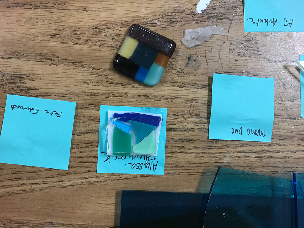
Glass Project
Glass vocabulary:
Description - Description is identifying the literal qualities or realistic presentation of subject matter, along with the elements of art found. It demands only the facts of what can be seen, often in one or more works of art; and partly two or more works can be described by comparing them to each other.
Design - A plan, or to plan. The organization or composition of a work; the skilled arrangement of its parts. An effective design is one in which the elements of art and principles of design have been combined to achieve an overall sense of unity.
Dominance - The part of a composition that is emphasized, has the greatest visual weight, the most important, powerful, or has the most influence. A certain color can be dominant, and so can an object,line, shape, or texture.
Form - The element of art that refers to an object with three-dimensions (height, width, and depth) and encloses volume.
Hue - The colors name. Example: red
Proportion - The relation of one thing to another with respect to size and placement.
Variety - The combination of elements or art, such as line, shape, or color, in an artwork. Variety is a principle of design.
Glass project reflection:
This project didn't go as well. Someone stole my first glass project so I had to redo it. Total bummer!
Silk Painting Project
Silk painting Vocabulary:
Analogous Color - Colors that appear next to each other on the color wheel. Analagous colors have one hue in common. For example, blue, blue-green, and blue-violet all contain blue. Also called related colors.
Color - The visual sensation dependent on the reflection or absorption of light from a given surface. An element of art made up of three distinct qualities: hue, intensity, and value.
Complementary Colors - Colors that contrast with one another. Complementary colors are opposite one another on the color wheel.
Cool Colors - The family of colors that includes greens, blues, and violets. Cool colors bring to mind cool things, places, and feelings.
Gutta Resist - Prevents dye from reaching the fabric; it resists the dye.
Intermediate Colors - Colors that are a mixture of a primary and a secondary color. Blue-green, red-orange, and red-violet are examples of intermediate colors.
Primary Colors - Colors that are mixed to make all other colors. The primary colors are red, yellow, and blue.
Secondary Color - A color made by mixing two primary colors. An equal mixture of primary colors. The secondary colors are green, violet, and orange.
Warm Colors - The family of colors that includes reds, yellows, and oranges. Warm colors bring to mind warm things, places, and feelings.
Silk painting reflection:
I chose my name to put in the center of my artwork. I liked it best because I used a graffiti maker so it adds some flare to the rest of the art. The images I chose are relevant because our theme was "nature", so I added what looks like bubbles underwater and then seaweed coming towards my name. The color scheme that I chose was mostly blue for the underwater effect, but then I wanted to add some contrast so I added pink and purple to the inside of my work. I did this because I thought it looked more vibrant. I think the biggest part of my project that I excelled in was my techniques. I loved the water drop technique I used in the center because it added to the underwater theme I was going for. I was challenged with the bubbles though when I was suppose to add color to them because some spaces were so small It got challenging and made it easy to bleed through.
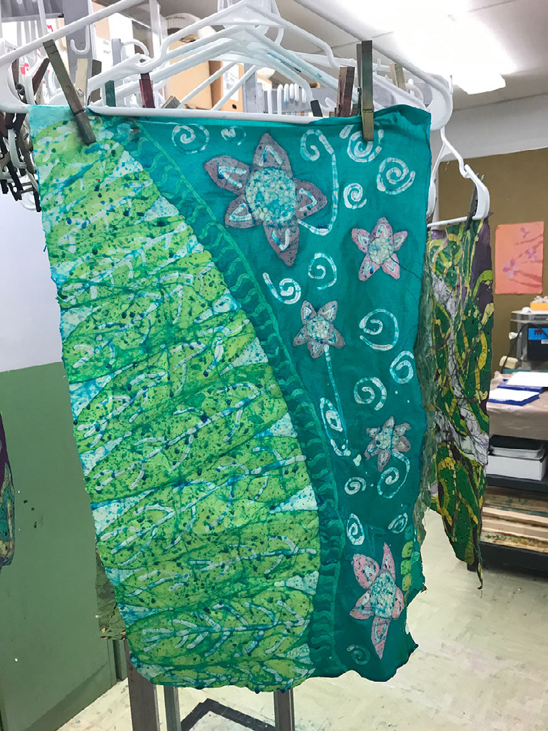
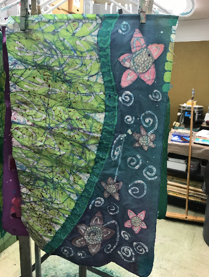
Batik Project
Batik vocabulary:
Chroma - The purity of a color or its freedom from white or gray.
Color relationships - Also called color schemes or harmonies. The relationships of colors on the color wheel. Basic color schemes include monochromatic, analogous, and complementary
Color Wheel - A circular diagram of the spectrum used to show the relationships between the colors
Contrast - The differences in elements, opposites.
Emphasis - The significance or importance given to an element of design.
Movement - Visual flow through the composition.
Pattern - Repeated colors, lines, shapes, or textures in an artwork. Pattern is a principal of design. Also, a plan or model to be followed when making something.
Repetition - Repetition refers to one object or shape repeated.
Rhythm - The repeating of one or several elements to create movement.
Tint - A color such as pink that is created by mixing a hue with white. Also, a light value of a color.
Tjanting - A tool used in creating batik patterns. (Batik is a wax resist decorative technique used on fabric.) They hold and dispense hot wax in such a way that the artist can control the pattern laid down by the wax with a great deal of precision.
Triad - The three color scheme on the color wheel based on a logical relationship.
Value - The element of art that describes the lightness or darkness of a hue.
Batik reflection:
My color order was yellows, to greens, to blues, to purples, and then I painted parts of mine separately. The hardest thing about the batik process was probably coming up with a creative design and then waxing certain areas to make it look good. I learned about color mixing with my batik because you must use the color wheel to make sure the colors don't turn an ugly brown and that they look good together. I wish I would have learned/understood how to wax certain areas so I had more variety of colors in my batik before I started this process. If I did it over again I would do my design and colors differently.
Art Quilt Project
ARt quilt vocabulary:
Appliqué - Attaching individual pieces of fabric to a background to form a design. These pieces usually have edges which are turned under, except for the process called raw edge appliqué. Raw edge appliqué can be seen in primitive designs or in art quilts. Finished edge appliqué can be turned under around freezer paper, needle turned - turned under with the needle as you sew, can have it edges glued down or it can be lined. These pieces are usually curved and often are representational, such as depicting flowers, birds, faces.
Art Quilt - A two-dimensional work of art made from fabric and other materials, having at least two layers stitched together. They are made from techniques based on traditional quilting methods, but may add other elements such as painting, printmaking, photography, graphic design, assemblage and sculpture.
Batting - The "filling" of the quilt sandwich....i.e. top, bat, & backing. Batting is available in a wide variety of sizes and content. People used to use flannel or blankets inside. It makes a difference if you are choosing to hand quilt, tie or machine quilt the finished project. Talk to others about their preferences, and then try it out.
Binding - The edge treatment of a quilt, finishing the quilt project.
Brainstorm - A technique used to solve problems, encourage creativity and develop ideas about a subject.
Landscape - A picture of natural scenery.
Personal Landscape - A place that has special meaning to an artist. It can be scenery, part of the natural world, or a place where we live. Personal landscapes often show ideas about the world.
Quilt - A bed cover made of two layers of cloth with a filling of wool, cotton, or down held together by patterned stitching.
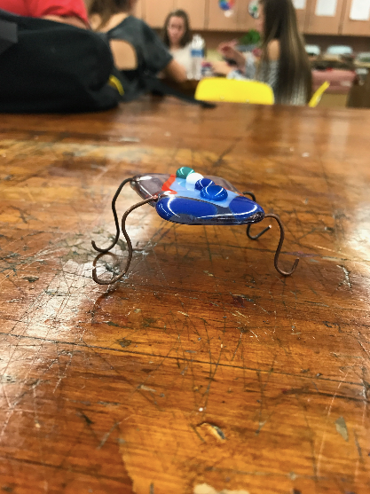
Bug Project!
Bug reflection:
I enjoyed making the bugs. It was fairly easy since I was familiar with using glass from our glass pendent project earlier in the year. First I researched bugs and found a colorful creature I liked. I then sketched it and colored it in, planning which glass shapes I would use along the way. Next I cut glass and set up the "bug". Lastly I put it in the kiln to bake it all together. I did this 2 times because I wanted pieces to stick above my actual piece and not melt all together. Once that was finished I cut the wires to an appropriate length I desired and curled them to add a design.