My name is Irina. I work as designer and educator in Russia. Right now I'm exploring user experience design and learn UX to UI online course with Adobe Generation Pro. This is my learning journal. The purpose of this journal is a comprehensive reflection and accumulation of my learning experience on the course and here I publish results and observations regarding to each phase of my work.
Me and UX short video
CLASS 1
I am developing hand-made project on Internet sumkiskartinkami.ru We create handcrafted bags and accessories with bright embroideries and prints. Key message of our project is gifts for girls and women that help to keep good mood long after a holiday.
KEY PROBLEM
Now our website looks like a traditional online store, while primarilly we want to offer good warm emotions our customers will feel again and again using our bags. Handbags and accessories for us is just a way to give a mood. Therefore, we need now to turn our traditional online store into the project with a mood. However, we would not want to do it using features of graphics such as for instance manual graphics (gouache on paper, etc), so as we sell things that fit into modern real world. We guess it is important not to seem unfashionable and unprofessional. So, our task is also to keep the modern graphic design of the site and of the project.
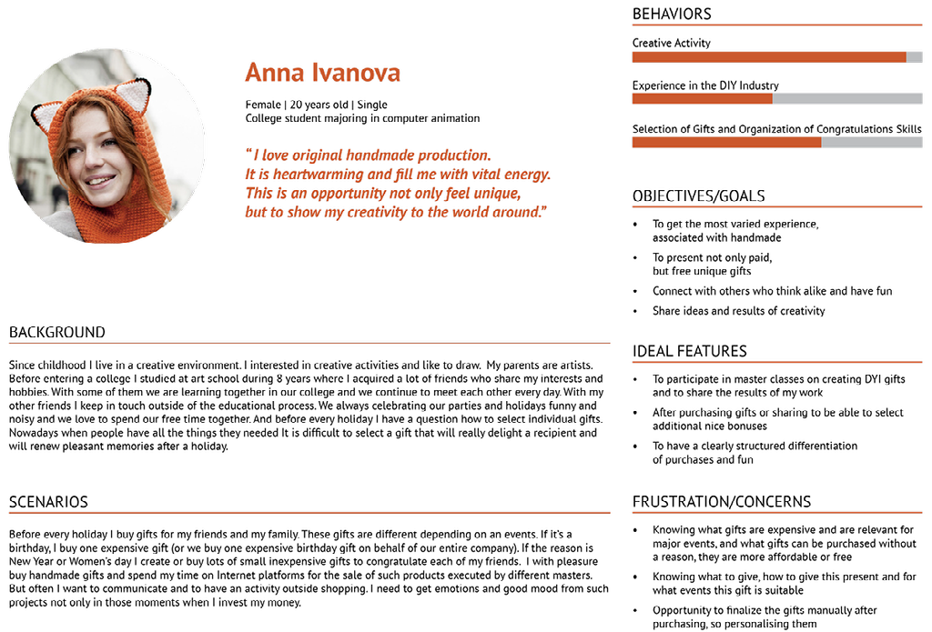
PERSONAS
I've identified as a problem needing to be solved in the framework of this course the lack of an emotional component of my online store. Therefore I asked questions my audience in relation to the chosen theme. I tried to find out from potential customers what activity they need on our website and what actions can help to make clients ' attitude a more warm and friendly. Based on the answers of the audience I modeled two personas.
CLASS 2
ORGANIZING MY WEBSITE CONTENT AND SITEMAP CREATION
Within my work I do not create a completely new website or mobile application, my challenge is to improve existing website to make it more relevant and appropriate to the expectations of our customers and our potential audience. A feedback received at the previous stages of the project from our audience is demonstrated our audience lacks companionship with our handmade project. Therefore when I tested how to organize my website content with my test participants I asked participants of this survey to concentrate mainly on the harmonious inclusion of fan zones in my existing site. But I also did not restrict test participants in new organization of existing site elements according to the logic that differs from a setpoint if the organization of elements that exists on my website is perceived by test participant complicated or incomprehensible. According to the test results, I created a site map (see below).
Class 3
CREATING THE PROTOTYPE
Based on the previously developed site map I created a paper prototype and put it to a test with our target audience. However, as the objective of my course project is developing a fan zone and its organic inclusion in content of our web site I asked my test participants to begin their work with a site from a specified action. In the first activity, it was necessary to navigate from main site home page exactly to the fan zone using the Fan Zone menu button. After this action test participants were invited to navigate the site prototype only on a basis of their own preferences. However, when test participants went beyond the fan zone, I was reminded to them that participant came out of the field of testing and any further action after exiting the fan zone we do not test. But I evaluated this user experience as successful, because a role of the fan zone is to increase in consumer activity on our website.
I started to work with our test participants, using recording on video camera. But during testing I found that our participants do not feel free enough in front of the camera and behave unnaturally. Also, test participants were too concerned about how their voices sound in shots and distracted from the test. For this reason, I declined recording on video camera and a fragment of the test (see below) is presented without a dialogue. After recording a fragment, showing the testing principle, we conducted all further work without a video camera. I monitored a logic of users behavior on the site writing in a form of participant a sequence of numbers that mark top right corners of the paper prototype. I also noted in this form information if a participant did not seem clear enough marking the step where it happened. Some shortcomings were discovered during the testing process, that were corrected on the next stages of the project. However, common navigation logic that was suggested to the target audience was to our test participants quite comfortable.
A main page of our website remained outside testing. Now it is a showcase of online store. But I have not yet tested the main page and I'm not sure of the correctness of this decision. And I have planned for the future (outside of this course project) to test alternative scenarios for the beginning of communication with website.
As the site is being developed for Russia and tested on Russian-speaking audience, test prototype in the video is presented in Russian.
FINISHED UI PROTOTYPE
I'm working with an existing website that already published on the Internet , therefore now I am not designing a website from nothing and have to work with existing grid of the site. So instead to selecting of one of the preset grid options or creating a new site grid for organization of objects, I have focused on the exploring of an existing template to organize new information on the already developed scheme. I analyzed wordpress website template and found patterns of organizing information. Also on the prototyping stage I changed a menu. Now a permanent part of the menu became shorter (top row) and a bottom line of the menu appeared variable depending on the parent category.
class 4
MOODBOARD
Our project is definitely about a woman. About each unique woman who is beautiful in any age. About a woman and for women. This project equally for girls and for adult women. It is a project about women's sensitive inner world. About creativity and empathy. About creation of a new wonderful special life. It is a project about love. About self-love that opens an ability to give soulfulness and care to her family and her dear people. It is a dialogue with women's inner self. Conversation without witnesses when it is not necessary to play any social role. This is an ability to understand and accept herself. This is a mood that gives beginning of a real full of sincerity life.
STYLE TILES
As our site exists and already works, I did not aim to significantly change its design. Therefore, some elements remained unchanged. For example, selected as textures stylized cross stitch pictures of animals we already actively use. Kitties are decorated banners in our online stores on livemaster.ru and on our group in the Russian social network Vkontakte, and the image of bear with a heart we use to thank customers for their order in our store. Page with this image appears on the screen of our client immediately after placing an order through our website. Nevertheless, creating of style tiles enabled me to look critically at our website and to improve some elements. For example, I changed the hyperlink color based on the palette moodboard. Earlier our links were red and annoying, I made their calmer.
LAYOUT
class 5
WORKING PROTOTYPE
As a result of solving the problem that was defined for our handmade project as a lack of emotional feelings I developed more friendly to communicate our site structure. Fan zone was organically included in the structure of website and it made the project more interesting outside online shopping process and able to motivate audience to purchase. However, for right motivation of our audience it is not enough, and we have to pay greater attention to developing of offers to stimulate consumer activity. Therefore, we have to create workshops, promotional offers and other content that could stimulate not only getting fun from communication with our website, but also purchasing activity.
During this project work I developed a clear structure, created and tested the prototype, and organized new information according to the previously existing modular grid of our site. Nevertheless, my global work with site is not finished, I created and showed in video test only basic navigation structure, logic of information organization, common graphic style and color scheme.
The assumption about necessity to raise interest to our project not relying in the first place on methods of graphics that was made at the beginning of my work only discovered the problem and helped to put priorities correctly, but a deeper study demonstrated necessity of refining graphics part of our project.
While the website had a more simple structure, design of it seemed sufficient. Bright and moody products presented for sale on the main page of our site, attracted attention to themselves. Therefore, a simple laconic design has been fully justified and perfectly coped with its task – not distracting from products for sale.
During developing a more complex website structure, I saw new pages of fan-zone that was created based on existing design looks schematically and stereotyped due to simple graphics and it is difficult to differ them from each other. This confuses an audience. For example, a page with offers to accumulate bonus points does not differ visually from the page, offering seasonal and continuous discounts.
So my new task is a careful work with design. I plan to create badges, icons, deeper work with color based on the created moodboard and style tiles.