My Artwork:
"Heaven to Earth" Paper, Sharpie
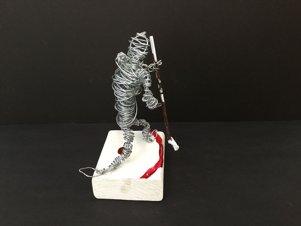
"Going for the Goal"; Wire
"Inspired by Matisse"; Canvas & Construction Paper
"Going in Circles "; Paint
"County Line Road"; Pencil & Sharpie
I used the need for the rule of 3rds on the left side of the drawing. I put most of my action there with a large building in the bottom half of the side and two smaller buildings on the top side of it.
- I used lines in my drawing. There are vertical, horizontal and diagonal lines. The diagonal lines are used to put the entire drawing in perspective as they all recede back to the single vanishing point towards the right of the drawing
- The use of value was also used to help put my drawing into perspective. Lighter values were used towards the front of the drawing and as things receded back they got darker. This is due to less light not reaching as far back and so less light hits them
- The last element of design that I used was space. Due to the perspective, each building is spaced separately. There is one barn to the right side that is spaced away from all the buildings. The rest are closer together with the two in the back being the closest to each other.
Artist analysis:
Artist: Robert Indiana
Title: Art
Size: 182.9 x 182.9 x 91.5 cm
The Point of Emphasis in this piece of art is the letter A. Indiana makes this the point of emphasis by making that letter significantly larger than the other two.
I see the element of color used in this sculpture. The outside of the letter A is a light blue color while the inside of the entire sculpture is red. Texture is another element seen, with the light creating a sheen on the metal. There are contrasting shadows that we can see from the perspective which shows a smooth texture as well for the metal. The entire sculpture is made from lines in the shape of letters. There are diagonal, horizontal, vertical and curved lines in this sculpture.
This work makes me feel a bit on edge. With the diagonal lines and due to the perspective it looks like the whole thing might fall over. The R is leaning up against and using part of the A as its leg. The T is standing up straight but is also supporting the R. Overall the entire feel is balanced for me and it is eye catching and pleasing to the eye for me. The colors contrast very well and it creates nice shadows.