Hi,
Thanks for taking part in "5 ways to use colour of the year 2018" event. My name is Susan. I am a nail technician (just like yourself), a nail blogger, online webshop owner and educator.
Starting out as a nail technician is not easy! You are not just there to do your clients nails, not just there to give a nail enhancement that lasts 4 weeks before infill times come.
You are there as a nail stylist, someone who knows exactly what is trending at the moment! A nail stylist who can see colours, a nail stylist who can put colours and designs together to amaze her clients.
Pantone, the global colour institute, has announced its Colour of the Year and moved away from the natural shade of forest green opting instead for "a spiritual, cosmic hue" of purple.
Pantone has announced the colour of the year 2018 as Ultra Violet, " a blue- based purple that takes our awareness and potential to a higher level."
A beautiful colour that will be very, very popular in the salons for sure. Let me take you to a higher level today, and let's talk about
COLOUR THEORY
in general!
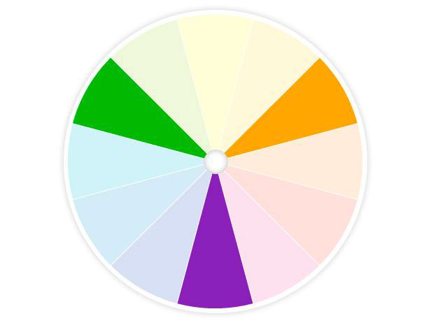
In 1666, Sir Isaac Newton discovered that the pure white light contains the full spectrum of colours. So he created
The colour wheel
In traditional colour theory, primary colours are the 3 colours that can not be mixed or formed by any combination of other colours. These primary colours are red, yellow and blue. All other colours are delivered from these three.
Black is a universal colour. It looks elegant in any combination. You can also add a drop of black to darken colour.
White combines with everything. Add a drop of white to lighten any colour.
Secondary colours are formed by mixing the primary colours together. These are green, orange and purple.
Tertiary colours are the colours formed by mixing a primary and a secondary colour. Yellow - orange, red - orange, red - purple, blue - purple, blue - green and yellow - green.
What is colour harmony?
Harmony can be defined as a pleasing arrangement of parts, whether it is music, poetry, colours or even ice cream. In visual arts, harmony is something that is pleasing to the eye. It engages the viewer and it creates an inner sense of order and balance.
Analogous colours are any three colours which are side by side on the colour wheel, such as yellow-green, yellow and yellow - orange. Usually one of the three colours predominates. They usually match well and create a serene design. Make sure you have enough contrast when choosing an analogous colour scheme. Choose one colour to dominate, a second to support and a third as an accent.
Complementary colours are any two colours which are opposite each other, such as red and green and red - purple and yellow - green. The high contrast of complementary colours creates a vibrant look. Tricky to use in large amounts, but works well when you want something to stand out.
Triadic colour shame uses colours that are evenly spaced around the colour wheel. Triadic colour shames are vibrant, even if you use pale versions of the colours. To achieve good balance, one colour should dominate and use the other two for accent.
How can I transfer this knowledge to Ultra Violet?
As analogous colours are next to each other on the colour wheel, they are creating pleasing and relaxing visuals.
How does it look like on salon nails?
Complementary colours are opposite of each other on the colour wheel, the opposite colour of violet is yellow.
How does it look like on salon nails?
A triad scheme is bold but more importantly, it is balanced. It is made up of any three colours that form a triangle in the centre of the wheel.
How does it look like on salon nails?
Why do I share this knowledge with you?
My main reason to start this "challenge" was to introduce colours to nail techs. I have been teaching for a while as well and after every nail art class, I can hear: "I have never ever thought to put those colours together before".
Yeah, I bet so! And? Now that you tried to put those colours together? How do you feel? Do you feel energetic? Vibrant? Do you feel you can stand out from the crowd?
I am guessing the answer is yes, right? ;)
I have been searching and searching Facebook, Pinterest, Instagram ( you name it ) for nail art ideas, matching nail colours to violet or even to purple. And do you know what did I find? Pink and purple. As I always say, pink and purple, flower and butterflies. These ideas are great ( or shall I say safe?! ) but will never, ever make you stand out from the crowd!
Why? Because this is what everybody does! Because it is safe!
So stay with me on this "challenge", learn some new salon designs, learn how to put colours together and stand out from the crowd!
Looking forward to seeing your development in colours and salon friendly nail art ideas in the next couple of days!
Lots of Love,
Susan xx
P.S.:You can get in touch with us! If you have got any questions or need any help, please do not hesitate to contact us via email and we will get back to you as soon as possible. Our email address is susansnailstore@hotmail.com.
Our website is www.susansnailstore.co.uk