Initial Research
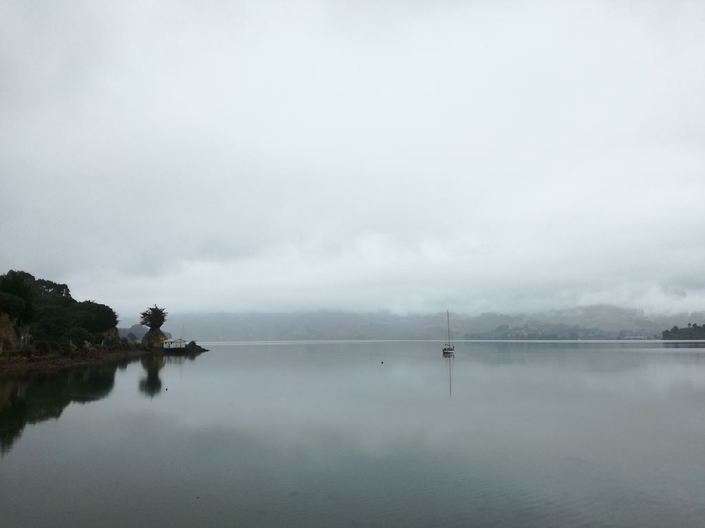
All of these spreads focus on a main image that takes up a whole page. They are heavy on the use of white space. Alignment is a key element working in these spreads - the use of alignment ensures that the spread feels clean and the text is easy to read. Because the focus will be on the main image, it would be important that that image is edited to ensure that it has impact.
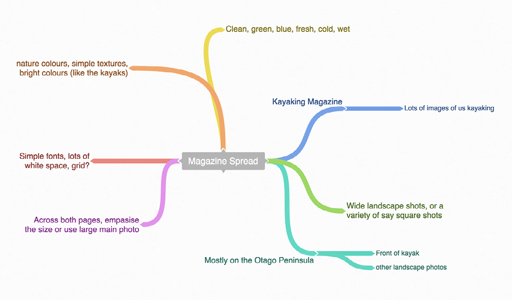
Brainstorming
Photo Editing
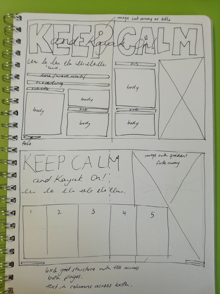
I have looked into some ideas around font choices. IndesignSkills makes a number of recommendations. I am thinking that I will be using a sans-serif font for my headings. Something light, but it will have to have enough weight to draw attention. I think that the body text could handle being a serif font- but I am not sure. I have also looked at some other techniques to make my magazine layout stand out. The key idea I have drawn from this page is making something very large scale - even off the page to add impact.
Refining Ideas
Colour Palettes
There are a couple of potential colour palettes that could work for my theme. I like the idea of a more muted colour palette, but still with those highlights of colour that you get when out on the water in a bright coloured kayak.
Credits:
Created with images by kconcha - "magazine colors media"