what is illustration?
Illustrations provide a visual representation of the idea you're trying to communicate towards an audience, whether it's in published media such as posters, book covers, videos, animation, branding and within products or independent artists selling prints, stickers, etc for visual aesthetic imagery.
What is Digital Illustration?
by definition:
A definition by Techopedia - "Digital illustration involves the use of digital tools to generate art directly from the artist’s hand, through an interface that translates that movement into a digital display. Many of these tools involve using a stylus to draw on a digital canvas."
...And I strongly agree with this definition! My addition would be that a lot of digital illustration is not just through the use of a graphics tablet, Digital Illustration can be completed via almost any type of creative software and it doesn't just exist within PCs anymore. I believe apps are improving and are becoming a new essential tool for artists on the go (smart devices, tablets, ipads, etc).
Raster vs Vector
I also realise there are two types of formats that fall within digital illustration: Rasterised and vector based illustration. To define the category in which a digital illustration falls into, you must determine what software has been used and the distinct overall look the image has in terms of texture, glows, fuzziness or sharpness.
Vector: The illustration will be clear, defined and smooth consisting of thousands of lines and curves compiled together to create the image, mixed amongst the mathematical theory behind it. The software used to produce vector based illustration will include editable anchor points that are created via point, click and drag movements. Key tools that are found on vector software consist of: lines, strokes, colour fills, shapes and gradients. Due to the mathematic formula behind it all, you are able to scale freely without worry of blurriness and resolution problems. Vector based illustrations can be smaller in file size and easily transferrable in comparison to raster.
Raster: Also known as "bitmap", raster illustrations are typically formed within a software that allows digital painting and are composed of pixels. The software allows multiple layers that give you control and the ability to isolate certain parts of the illustration, this is especially useful for artists to focus on details and build the image up. You can create shadows, highlights, a variety of textures, glows and the illusion of hand-painted brush strokes easily within a bitmap program.
What creative softwares are out there and which does what?!
I mean there's so many old and new softwares out there that we artists primarily use, though, anything produced by Adobe tends to be the typical "Industry Standard" way of working. What you find with Adobe Photoshop and Adobe Illustrator in particular is that they can work harmoniously together, or beautifully on their own and boast noticeable differences. Adobe softwares have included both rasterised and vector based programs that will give you the two different illustrative outcomes.
Adobe photoshop
Photoshop can feel increasingly universal in comparison to Illustrator, as you can also manipulate images, freehand draw with a stylus, edit images, graphic design, web design, video editing and gif creating. Honestly, the list can be endless. To create digital illustrations though, the main method is using a graphics tablet and a stylus to freehand onto the digital canvas and build upon with layers with colour, highlights/shadows, etc. You can also make sure you're adding shade, texture, glows, grains, blurs, (I could go on) as well as adjustments due to the extensive tools!
Alternatives to PS:
For digital painting (rasterised, bitmap illustration) I have found a list that consists of the best softwares: Corel Painter 17, Particleshop, Autodesk Sketchbook Pro, Black Ink. (Most of these require subscription fees or a purchase fee) Some free softwares: Krita, Inkscape, Serif Draw Plus.
adobe illustrator
Illustrator is primarily useful for creating vector graphics, line art, print, logos, etc. This forms a different type of Digital Illustration creation, that feels generally smoother and clean with less complex tools. You are able to edit individual anchor points from lines and shapes which give you a different source of freedom in comparison to Photoshops eraser tool and layer mask methods.
Alternatives to AI
For vector based illustrations (similar to adobe illustrator) I have found a list that consists of similar programs that allow vector creation: CorelDraw X6, SVG, Sketch and Affinity.
Combining the two?
When combined together, you could begin your design process with initial sketches or fine-lined drawing (whichever helps you further development), then scan these into your PC/Mac and upload the image into Adobe Illustrator. Afterwards, you may then use the pen tool to create clean crisp line art on a new layer, then another to adjust the width before then uploading into Photoshop as pixels or a smart object. In this software you can then begin adding colour and detail, starting with a base simple colour and building up layers of shading, texture and highlights.
As well as this, you can create mixed media techniques by creating vector graphics in (e.g) AI and importing these into PS to place alongside photography, textures and other images. This will also depend on the outcome of what you are trying to create, as you it will still have to be suitable for the brief/audience.
Apps? Apps! Appppps!!
I couldn't not include an alternative to pure PC software, because the industry grows with new techniques and tools as technology grows itself. Although on launch, tablets and iPads were sold as entertainment devices (especially for social media, films, tv, etc) and it would feel less adequate for design than a PC/Mac with top software, they are now up there for artists on the go. Graphic, Photoshop Sketch, Assembly, Inkist, Adobe Illustrator Draw, Adobe Pro Create are all from a list of apps that help convenience us graphic designers, artists and illustrators.
why? what for? whats the purpose?!
Digital Illustration is quite literally everywhere, from the graphic tee's you own to your favourite brand of crisps (the packaging of course). The possibilities feel never ending and thankfully keep us graphic designers, artists and illustrators in with a job as there's such demand for it in every aspect of our commercialised lives. Even though there are traditional methods and mediums that exist for the creative industry, I recognise technology is always going to be the future, as well as popular and leads to digitalisation a lot of the time.
in terms of a brand or company:
The purpose of these visuals themselves is to create brand identity, generate a style thats aimed towards a specific audience and/or to visually entertain. Brands typically have vector based logo designs that are stand alone typography or incorporate a symbol/decoration that will undergo the process of a digital illustration technique. A lot of new brands will undergo a digital process rather than purely handmade traditional methods as it's becoming outdated with such high end softwares. Colour themes, strokes, weights, patterns, textures and shading can all link these together to make a product link together and become marketable.
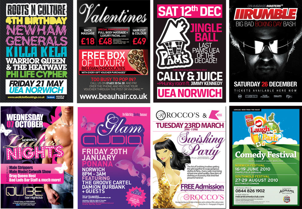
Example: Clothing companies that produce graphic tees will generally stick with a similar design theme that fits within their style guide for a designer to fit within. Though this may change with seasons or clothing collections, they make sure everything visually connects for the consumer to stay satisfied aesthetically as this would sell more. It's important for clothing companies to have a good amount of strong digital illustration to relate with their audience, as each design will be intended to suit specific demographics and they want to hit the mark each time.
Below, you can see although every design is different, the organization places each design carefully next to each other and visually relates to a design next to it. The designs used here also correlate to the demographic they are aiming towards, though this can also be seen through the models own visual aesthetic, the content of each t-shirt relates to a dark, gothic fashion trend mixed with witty humour (e.g. no friends, bat design, barbed wire).
in terms of a concept art/game art job:
Another alternate you find with digital illustrations is that they come in handy for concept pieces. An artist will typically use a raster software program to import their sketches and build upon to explore ideas. Being able to have loose sketches that are able to be cleaned up without the risk of ink smudges is something that is beneficial for an artist when producing their artwork, it helps in particular when you are able to show a boss the built upon layers and stages you underwent to produce the final piece.
in terms of marketing, adverts, posters:
Where would we be without visual imagery on any form of marketing? Especially on the internet, we are flooded with ads that entice us into deals upon deals. Most of these advertisements get to us by how they are presented, fonts, colour and style (in terms of digitally illustrated ads) as they are psychologically connotated to aim towards demographics.
Example: Club posters have bright, neon colours that stand out upon a somewhat darker background to emulate the tone of inside of the venue (dark, dimmed lighting with vibrant lights positioned to create a certain mood) which then entices your interest to visit. Though sometimes you find a lot of photography in these posters, there's also bountiful typography, decorative shapes and (dare I mention the topic) digital illustration. All of these are combined together to attract an audience and sometimes indicate the "stereotype" they want to attend their venue.
vector illustrators
After explaining my definition of vector based illustration I want to demonstrate my understanding by exploring a few different vector artists. All of the following images are sourced from http://www.illustrationweb.com/
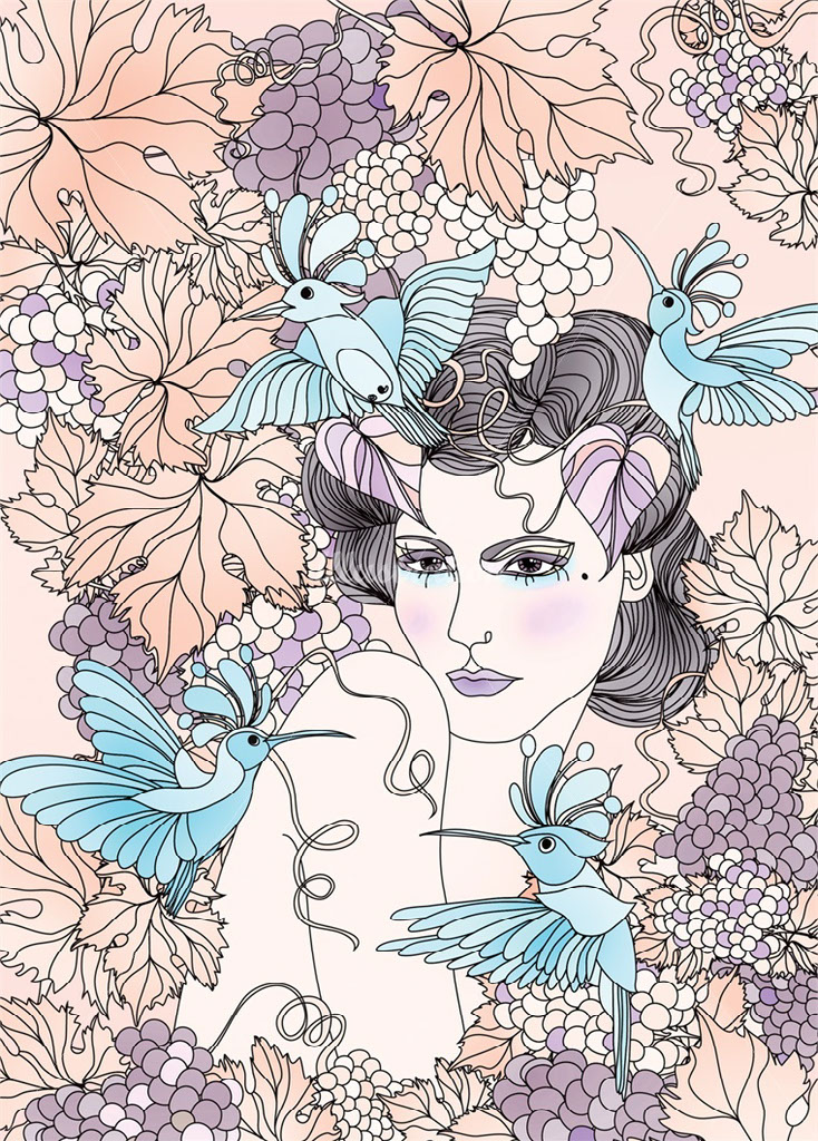
nadia flowers
New Zealand based designer Nadia Flower has grown up as a lover of art and design ever since a young child. Her studies, travels and job experience in both graphic design and fashion lead to a career as a freelance illustrator. Nadia has a BA in fine art as well as a major in Graphic design, which has helped her guide this career path to work with brands such as, Bourjois Paris, Elle, Lily Allen, Nina Ricci and Cosmopolitan.
You notice the amount of vector graphics that Nadia involves in her intricately designed artwork, boasting the use of a Mac, there's all kinds of unique details in each piece. Though every artist will have a preferred style, which for Nadia is black and white, you find splashes of colour to complete her pieces. Being diverse matters as an artist too, as you find she mixes in photographic media as well as inks and watercolour.
As you can see within her style, there are a lot of clean lines that insinuate the style of Vector illustration and also the display of mixed mediums with photography. Each piece of Nadias work embodies a "feminine" style that incorporates a somewhat hand-drawn effect that fits within a "high fashion" route of design. I believe some images may have textures added to complete the drawn effect below.
Ella tjader
Lithuanian born Ella Tjader has lived in multiple countries before finally residing in Switzerland. Her studies were originally within Vilnius School of Economics but later she discovered an online course in graphics and has been armed with her wacom tablet ever since. Tjader has worked with companies such as: Victoria Secret, Nylon Japan and Vogue Japan.
Ella has a way of working with soft, warm undertones that sometimes are wrapped within a black outline and provide us with an elegant, modern approach to vector illustration. Though sometimes she uses brushes in PS, Ella states that she primarily uses sketches to then transfer in to AI.
rasterised illustrators
After explaining my definition of rasterised based illustration I want to demonstrate my understanding by exploring a few different raster artists. All of the following images are sourced from http://www.illustrationweb.com/
Lennart Gäbel
Sourcing a lot of his inspiration from news and articles, Lennart is a determined artist that came onto the scene formerly from agencies and marketing looking for a new creative job. He studied Illustration at Willem de Kooning Academie in Rotterdam and at the School of Visual Arts in New York.
Lennart, like other artists, transfers his drawn out sketches into a creative software to then draw/design over. He says he typically uses a graphics tablet and finds it useful in terms of deadlines as it runs no risk of waiting for colours to dry. My favourites of his artwork seem almost satirical, and take on topical themes in modern day society such as Twitter, Donald Trump and society as a whole.
Bold colours encompass his style, or at least a pop of colour. Each piece included here stands out due to the contrasting use of colour palette amongst his sketched out strokes and large amounts of shading.
Examples of companies worked for: Samsung, E-On, SEAT and Amnesty Journal.
andreas preis
This artist is as confident with pen and paper as well as computerised illustration, with a portfolio full of designs. Andreas knew from a young age that he wanted to be within the creative industry, not necessarily what part, deciding upon studying communications design. His focus on illustration came after internships and working in big agencies, forming the career he has now.
His techniques usually begin with hand drawn designs using pens, pencils, markers and acrylic paint. Afterward becomes the digitalisation with using Photoshop or Illustrator. The textures, strokes and shading within his illustrations seem very etched in and fine.
He's worked for companies such as: Coca Cola, Adidas, DC comics, ESPN, Vans, Ford and Nike.
what are the advantages of visual imagery?
Visual imagery has many advantages over other forms or imagery due the ease of absorption by consumers due to the lack of effort on their own part. This means that rather than a consumer having to rely on themselves reading text on a written advert, or having to take time to listen to an audio advert such as a radio ad. Visual imagery allows the artist to convey the exact image they wish to get across rather than relying on the consumers own imagination to picture whatever product or service is being advertised.
five illustrated pieces by me
For this "collaborative" piece I wanted to explore my use of the width tool when creating an inked style piece. This was originally for a tattoo design for Lauren that I ended up digitalising and changing to fit her needs when she eventually books the tattoo, so small elements were changed to add my own style to this piece.
To begin with I inserted a photograph of the sketch on a separate layer, then began to build upon from there. The next layer would then consist of a basic outline that has a singular stroke width and then adjusting elements of the ram skull as I went, (the teeth, bottom of the skull itself, parts of the horns and eye sockets) so that this could further be manipulated on another new layer. Afterwards, I copied and pasted what I had completed with a basic stroke and began to manipulate with the width tool. This was particularly useful to add points that would minimise areas (the effect of ink running out) and slightly exaggerate others (the effect of ink blotting). Once satisfied I began to add the decorative pieces around the skull, and after trying and finding a dislike of Laurens original idea of a moon/mountain combo I went for a bunch of crystals on the top, mountain dunes (to keep a desert theme) and the same style of flowers throughout (This was again on a new layer and manipulated again on another).
I found after trial and error with finding what aesthetically looks best, I came out with the best outcome possible and I am extremely satisfied with the results. I've definitely experimented and developed myself with being able to accomplish a style of tattoo that I admire personally too. Being able to use the width tool properly was something that I've tried and failed with before, and now I feel increasingly confident as I finished this piece.
This piece was a revisit of a task we completed in the first year of this course, I wanted to be able to apply the same method and create something new and unique (as everyone had the same outcome before). This method was completed in Adobe Photoshop rather than soley on Adobe Illustrator (which was used to edit the trees, houses, wolves,etc) and was quite out of my regular comfort zone.
By using PS' lasso tool I was able to build up edgy rasterised layers with just a few drags of the mouse, which proves that even a simple tool can have effective outcomes. When sourcing different free tree silhouettes I decided that I wanted to add more than just trees and mountains this time and thought it'd add interest to create a story-like scene within using houses, wolves and a cabin-style house. As well as this, having a readily available colour palette was useful for the sunset colours to blend so well together and create depth by having darker colours towards the front. To add an overall faded colour to the image to make it appear a little less flat, I decided to add a rectangle over it and use a filter (multiply) and lower the opacity.
I enjoyed revisiting this project, as a method that felt so simple gives off such a well rounded polished look and I think i'll be creating a series of them in the future. I think I achieved what I wanted to, and proved to myself I could remember the overall steps to create this landscape scene. The few elements I'd like to still incorporate are some smoke effects, and some glow to the moon so that it doesn't appear so flat.
This piece was for an secondary action project in my first year, and the outcome is still one of my favourites! I had been wanting to create a hidden tavern scene that feels straight out of an actual animation. I can see now that maybe mixing 2d and 3d might not be as effective as if it was one or the other but I am still happy with it.
My inspiration for this piece came from looking at medieval designed tavern sketches, that then lead to a mood board for referencing when creating in Adobe Ai. I used the pen tool to create the shapes that create the tavern, and glow effects that make the scene feel more alive. This was created before I became a massive fan of adding gradients to give depth, so there may be a lack of that where I could still add to.
From this though I learnt a new way to shade by using the knife tool. This was from copying and pasting a shape on top of itself and using the knife tool to cut away the highlighted/shaded area and then being able to change the colours to lighter/darker depending on the situation.
In this lyrical reference typography piece I wanted to relate the typography to the lyrics visually, (which was done via yellow for "fast food"). I also wanted to explore a tutorial I found on subtle shading to make typography stand out, rather than feel flat against the background.
To do this I first found a font I liked and began editing it to my needs (purely on the fast food type) and adjusting with the smooth tool to get a new look for the type. This then lead to me adjusting the gradient to be black on one side and transparent on the other to then create shapes with the pen tool that would result in shading. I placed my gradients wherever I saw a loop to differentiate and enhance certain parts of the text and create the illusion of shadows as well as show how in calligraphy the pen would start/finish. To crop this I then used a layer mask and clipped it to keep this in place and then made a new layer to create circular text using the warp tools. To finalise this piece I also added a new layer with a rectangle to cover the image and lower the opacity and add a noise effect.
Overall I'm satisfied with the final piece, as it's a reference to one of my favourite songs by Dog is Dead and I feel as though the typography itself is creative enough to reflect the song. I've learnt more shading techniques which are very useful for someone that is horrendous at shading herself! I will be following this tutorial again in the future.
This project revolves around a theme for the young creative awards which was Future City and I wanted to visually show my ideas of an overgrown, glass city with some memorable features. Everything done here had been using the pen tool over and over again the build up shapes that would in return make the final piece. Thankfully my hard work for this paid off and I am shortlisted to win in my category.
I had researched into eco cities before hand and looked at different dystopian/utopian concept arts of cities to get an idea of the route I wanted to take. This lead to me constructing a small perspective map of my ideal future Nottingham, which took around a full week to complete (yawn!). I created each building one by one and inserted them based on the perspective being overlooked from the left.
I had used the grid tool a lot as a guide for the perspective element of this piece and it helped me endlessly. To keep from this feeling boring and flat there are many different amounts of details in this piece, from the small birds, lions, moss, water ripples etc that made it feel personal and special. I wanted to make this feel visually relevant to a universal audience, hence keeping the colour scheme light, bright and fun when amongst the boring greys of the city. This also lead to the finishing touches of the sky/grass having an off-aligned border to keep it feeling fun and slightly childish.
To finish, I am happy with what I ended up finishing up with, although I would've preferred to not struggle on matching up the right side of the image to keep it full rather than empty. I wish I had found some new skills within this, but from all of my other pieces created I feel as though I've created something that shows the best of my ability as an upcoming designer/illustrator.