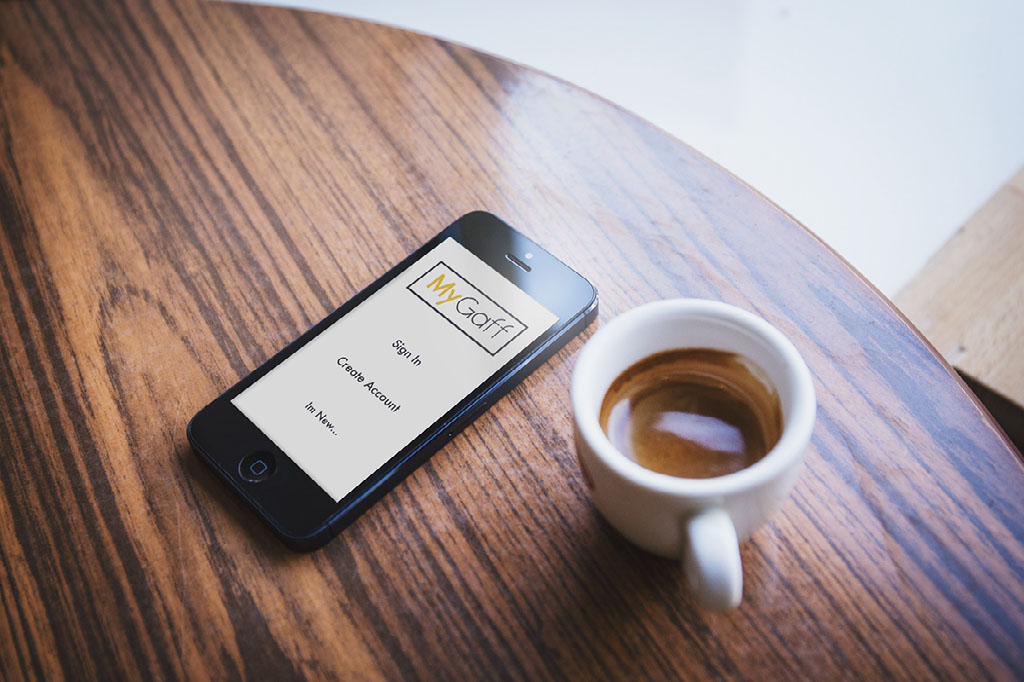
Design an App.
Create an app that meets the needs of both student and landlord. Students will want to search properties and Landlord will be able to showcase their properties. Both will be able to engage with each other. This app will include features for both student and landlord.
Mandatory Requirments.
- Easy access to view properties
- Community - Bars/Restraunts/Transport/ATM's etc
- Secure Payment Method
- Contact between both landlord's and student's
- Profile Page
- Calender
- Easy search engine for students
- Notes
- Language selector
Users.
A variety of students and landlords will use the app. People that speak different languages and maybe dealing in different countries. There will be a facility for the users to engage.
Card Sorting & Navigation Map
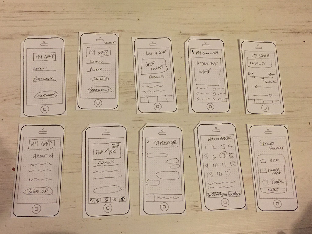
Card Sorting
Page titles where wrote on to bits of paper, i then got my fellow students to arrange them in their own way, the way they thought made sense.
Prototyping
A paper version of the app was complete. After feedback from the students there was some things to be added in and taken away. This gave me good indication as to what the final app will look like. No graphic design at this stage.
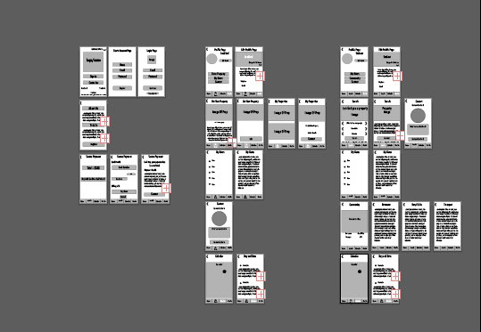
Wireframing
From the result of card sort exercise, wireframes were created in Adobe Illustrator. the wireframe finalises objects and elements in place.
Interactive Wireframe Prototype
Getting the look
Research
It was important to do extensive research to guide the look of my app, below i have detailed the process that i went through
The app has two users, a landlord and student. The two users both have different reasons to use the app
I started looking at other apps with the same purpose as mines. I wanted a clean and simple look - the majority of apps i looked at used a lot of white space as there is vital information that the user needs to know. The users would be using this app in most enviroments. I wanted to keep it bright and easy to navigate so the users can use this on the go. The colors used in these apps gave me inspiration for my own. I wanted good contrast between the elements and also the UI design patterns so there was no confusion and straight forward for the user.
Moodboard
Using all the information above i generated moodboards
Style Tile
The moodboards guided the overall look of the app, i then went on to create 2 style tiles, these contain, typefaces, colour schemes and interfaces.
The final User Interface design
The final pages were created in Adobe Illustrator.