25 years ago, National Basketball Association VP/Creative Director (and Gameplan Creative Founding Partner) Tom O’Grady headed out west from his office overlooking 5th Ave. for a fortuitous meeting with the NBA Phoenix Suns front office ownership team. The reason for the meeting: discuss the possibility of an entire rebrand and creative direction for the Suns brand identity which would be tied to their move into the new America West Airlines Arena in downtown Phoenix to begin play in the fall of 1992.
THE POWER OF PURPLE
Presiding over the initial design and brainstorming meeting was Phoenix Suns President and CEO (and recently Naismith Basketball Hall of Fame member) Jerry Colangelo, the driving force behind logo change request.
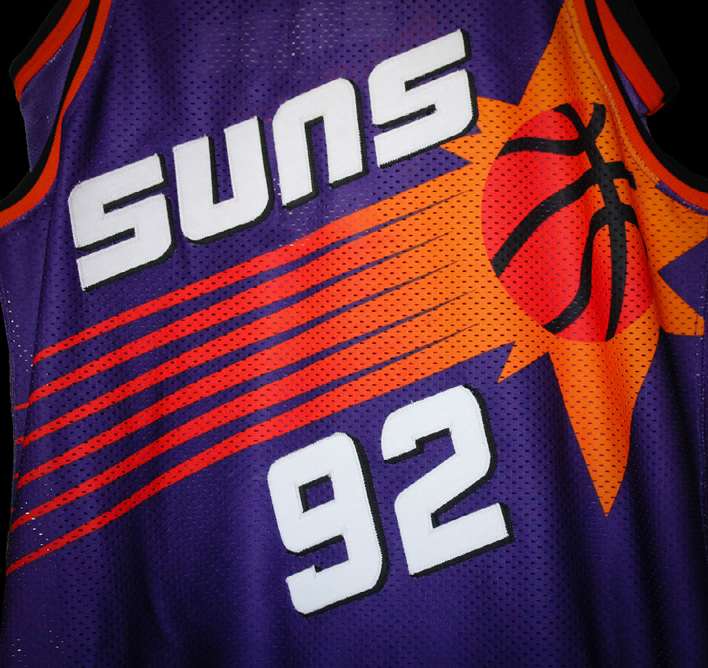
1968-69 The SUNS original logo featured the unique team colors of purple, orange with a copper ball that created a proprietary look for the team. A SUNS secondary logo was featured on the team’s shorts. And the PHOENIX jersey font was originally similar to the primary logo lettering then switched a western heavy serif font style.
"We feel it’s the ideal time to change our logo and uniforms with the opening the new arena, it was the closing of the first chapter in Suns history after a quarter century as well. I want to create something modern and bold to reflect the nature of the new arena and the growth of Phoenix. And I don’t want to revisit a new logo and uniforms soon.” –Jerry Colangelo
CREATING A MODERN CLASSIC
1992-93 To understand the Suns revolutionary design solution, you have to step back 25 years in time to understand the rapidly changing landscape of the graphic design industry. In the early ‘90’s the acceptance of Apple Macintosh computer and the widespread use of Adobe Photoshop software to create limitless creative solutions across many industries. As the NBA’s first creative director, O’Grady realized that design technology would change the look of the upstart NBA and the Suns rebrand was in the ideal sweet-spot to lead that charge into new ways of branding a sports team.
O’Grady’s approach was very old school (remember it’s 1991) where you create a series of pencil thumbnails, reduce that number and take your favorites designs into Illustrator. Streaking Sun concept. O’Grady used the familiar Suns purple and orange, but added touches of black into the existing color scheme. After weeks of back-and-forth changes to concepts and many meetings, the final design direction (and O’Grady’s favorite), a streaking sun, would become the direction Colangelo and the Suns really liked and ultimately approved.
RIGHT TEAM. RIGHT TIME.
Once Suns ownership approved O’Grady’s revolutionary logo concepts, an equally critical design challenge lay ahead: how would the new streaking sun graphic be incorporated onto the new Suns uniforms? While the Macintosh was revolutionizing how graphics were being created, team outfitters were slow in adopting to the changing design landscape. NBA uniform design submissions with color gradations and two and three color drop shadows were being rejected by team outfitters due to the added weight and extra costs to produce game uniforms. Team outfitters were continuing to rely on traditional cut and sewn fabrication, tackle twill lettering, and silkscreen player names, numbers and jersey trim.
“I was nervous about the jerseys fitting so many different sized players, from 7’7″ to 5’4” players at the time. My fear was that the Suns graphic would not have a common “sweet spot” on all these different sized and shaped players. Alas, it was not an issue, and once I saw Charles Barkley in the new uniforms, I was struck on how cool they were and how the designs fundamentally broke new branding ground for teams.” –Tom O’Grady Suns identity designer, Founder, Gameplan Creative.
With Champion on board, O’Grady presented his cutting edge jersey and shorts ideas to the Suns creating a streaking sun across the front of the home white jerseys and purple road jerseys featuring the same subtle dark yellow to bright orange to warm red gradations. Once again the Suns loved the new modern classic direction of the jerseys and approved the new identity in its totality.
A Modern Classic.
To see more projects like this click on the button below.